Chart Series Styling
If you followed the series overview section, you know what type of series is most suitable for the chart you need to create. This article will show you how to change the style of these series including their stroke, fill and labels.
- Using Series Properties
- Styling with CSS
- Styling Series Labels
- Styling with Palettes
- Styling Selected State
- Changing Palette Mode
- References
Using Series Properties
The chart has its predefined palettes that provide an automatic selection of colors for the different series that are used. When you need to change these colors you can set the corresponding properties of each series:
- fillColor - Determines the color used to fill the series. Applicable for series which use only one color for fill: BarSeries, RangeBarSeries, BubbleSeries, AreaSeries, SplineAreaSeries, ScatterSeries, ScatterBubbleSeries
- strokeColor - Determines the color used to fill the series. Applicable for series which use only one color for stroke: BarSeries, RangeBarSeries, BubbleSeries, LineSeries, SplineSeries, AreaSeries, SplineAreaSeries, ScatterSeries, ScatterBubbleSeries
- strokeWidth - Determines the color used to fill the series. Applicable for all series
- fillColors - Determines the color used to fill the series. Applicable for series which use more than one color for fill: CandlestickSeries, PieSeries, DonutSeries
- strokeColors - Determines the color used to fill the series. Applicable for series which use more than one color for fill: OhlcSeries, CandlestickSeries, PieSeries, DonutSeries
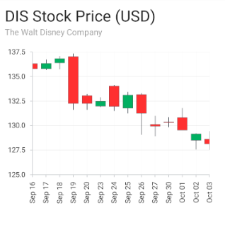
Note that the PieSeries and DonutSeries will draw their slices by using consecutive colors from the provided list, while the OhlcSeries and CandlestickSeries will only use the first two colors from the provided list. The first to draw the bullish points (whose close value is higher than their open value) and the second to draw the bearish points (whose close value is lower than their open value).
Styling with CSS
All of the above properties can also be applied through css. Here's an example to style a chart with BarSeries:
Example 1: Apply BarSeries styles through CSS
BarSeries {
    fill-color: #C8A1FF;
    stroke-color: white;
    stroke-width: 4;
}

BarSeries[index=1] {
    fill-color: #6215EE;
}
Here's how the chart from this example looks:
Figure 1: Bar Series styles on Android (left) and iOS (right)


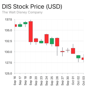
Here's another example that demonstrate how to apply a list of colors to a chart with CandlestickSeries:
Example 2: Apply CandlestickSeries styles through CSS
CandlestickSeries {
    stroke-width: 1;
    stroke-colors: #464D57,#464D57;
    fill-colors: #00B061,#FF3030;
}
Here's how the chart from this example looks:
Figure 2: Candlestick Series styles on Android (left) and iOS (right)
Styling Series Labels
Information about styling the labels of the series in NativeScript UI Chart is available here.
Styling with Palettes
Another option for styling of the chart series is to use Palettes. Depending on the count of series you have defined in your chart, you can add as many palettes as needed and change several visual parameters of the series. A single palette defines an entries property which contains PaletteEntry instances. A PaletteEntry is essentially a property bag which holds the values that are used to style the associated series. The following properties are exposed by a PaletteEntry object:
To better illustrate the usage of Palettes, we will use a scenario with three series of different kind which are customized. Consider the following series:
Example 3: Define a list of series
<chart:RadCartesianChart.series>
    <chart:BarSeries seriesName="Bar" items="{{ categoricalSource }}" categoryProperty="Country" valueProperty="SecondVal"/>
    <chart:LineSeries seriesName="Line" items="{{ categoricalSource }}" categoryProperty="Country" valueProperty="Amount"/>
    <chart:SplineAreaSeries seriesName="Area" items="{{ categoricalSource }}" categoryProperty="Country" valueProperty="ThirdVal"/>
</chart:RadCartesianChart.series>
We want to customize all of the series. We will use their seriesName to specify which palette is for which series. We want to change the stroke, as well as their fill color. Let's define a new palette for each series in the palettes collection of the chart:
Example 4: Define a list of palettes
<chart:RadCartesianChart.palettes>
    <chart:Palette seriesName="Bar">
        <chart:Palette.entries>
            <chart:PaletteEntry fillColor="#80FCE49D" strokeColor="#80E2A1F8"/>
        </chart:Palette.entries>
    </chart:Palette>
    <chart:Palette seriesName="Line">
        <chart:Palette.entries>
            <chart:PaletteEntry strokeColor="#FFCF40" strokeWidth="3"/>
        </chart:Palette.entries>
    </chart:Palette>
    <chart:Palette seriesName="Area">
        <chart:Palette.entries>
            <chart:PaletteEntry fillColor="#8060B3FC" strokeColor="#60B3FC"/>
        </chart:Palette.entries>
    </chart:Palette>
</chart:RadCartesianChart.palettes>
Our palette consists of a single entry that defines values for fillColor, strokeColor and strokeWidth. What remains to be done is mapping the palette to the series it is meant to style. This is done by setting the seriesName property on the series and the palette to the same key. As you can see, the seriesName property is set to the Palette and the series to the same value - in that case Bar, Area and Line. You can use any string token here assuming it is the same on the corresponding series and the palette, as it serves as a mapping key between both.
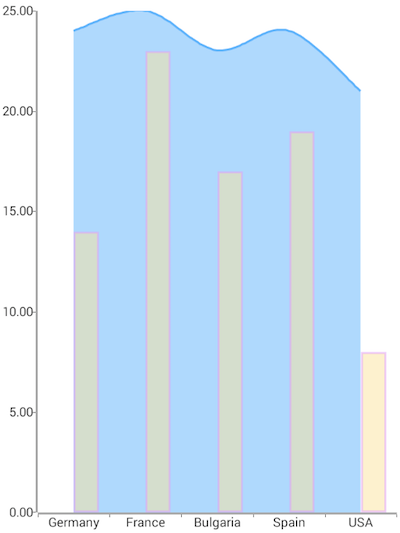
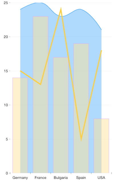
The images below demonstrates the result of applying this palette to the Bar series:
Figure 3: Bar Series styles on Android (left) and iOS (right)
Styling Selected State
If you want to specify additional style for selected state of the series you need to define a new Palette with the corresponding seriesName and seriesState property set to Selected value as it is shown in the following example:
Example 5: Selected State Palette
<chart:Palette seriesName="myBar" >
    <chart:Palette.entries>
        <chart:PaletteEntry strokeWidth="3" strokeColor="Orange" fillColor="Yellow"/>
        <chart:PaletteEntry strokeWidth="3" strokeColor="Pink" fillColor="Green"/>
    </chart:Palette.entries>
</chart:Palette>
<chart:Palette seriesName="myBar" seriesState="Selected">
    <chart:Palette.entries>
        <chart:PaletteEntry strokeWidth="5" strokeColor="Yellow" fillColor="Orange"/>
        <chart:PaletteEntry strokeWidth="5" strokeColor="Green" fillColor="Pink"/>
    </chart:Palette.entries>
</chart:Palette>
In this example the second palette values will be used when the series or data point is selected. If palette for selected state is not explicitly defined the default colors will be used.
Changing Palette Mode
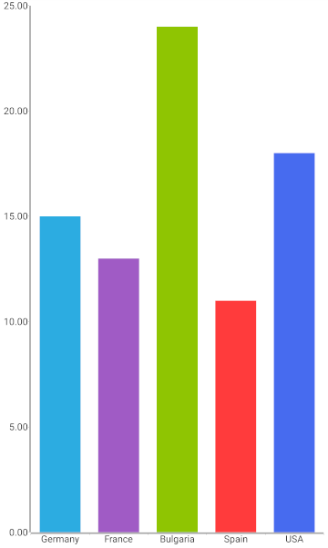
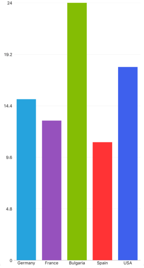
By default, the provided palettes (or the default colors) are applied per series, i.e. the first PaletteEntry from a palette will be applied to each of the items in the series. The paletteMode property can be used to change the way the palette is applied, i.e. the first PaletteEntry from the palette to be applied to the first item in the series, the second PaletteEntry to the second item, etc. You can choose from the following paletteMode values: Series or Item depending on how you want the palette to be applied. Here's how to change the paletteMode for BarSeries:
Example 6: Styling different bars
<chart:BarSeries paletteMode="Item" items="{{ categoricalSource }}" categoryProperty="Country" valueProperty="Amount"/>
Figure 4: Bar Series styles on Android (left) and iOS (right)
Note that the paletteMode is applicable only for series where it visually makes sense. LineSeries, SplineSeries, AreaSeries and SplineAreaSeries (where there are no separate items but only connections between them), the paletteMode is not supported.
References
Want to see this scenario in action? Check our SDK Examples repository on GitHub. You will find this and many other practical examples with NativeScript UI.
Related articles you might find useful: