RadListView Swipe Actions
The "Swipe Actions" feature allows you to implement actions associated with list items which are triggered by swiping the item left or right. For examples, you can organize a TO-DO application and let your users complete or delete to-do items by swiping them. Similar scenarios are also to be found in famous e-mail client apps. The "Swipe Actions" feature supports the use of interactive elements within the item being swiped, i.e. the main content of the item.
Here's an example of how the Swipe Actions behavior looks on Android and iOS:
Figure 1: SwipeActions feature in action on Android and iOS:
Please note that the items in this example have an explicitly set white background. When using swipe actions, your items should not be transparent, because otherwise the swipe content would be visible through them.
Enabling Swipe Actions
For this tutorial we will use the already familiar setup from the RadListView: Getting started section.
To enable the "Swipe Actions" functionality in RadListView you first need to set the swipeActions property to true:
Example 1: Enabling SwipeActions on RadListView in XML:
<lv:RadListView
    id="listView"
    items="{{ dataItems }}"
    selectionBehavior="None"
    itemSwipeProgressEnded="onSwipeCellFinished"
    itemSwipeProgressStarted="onSwipeCellStarted"
    itemSwipeProgressChanged="onSwipeCellProgressChanged"
    itemSwiping="onItemSwiping"
    swipeActions="true">
You can also set this property via code
Also note that we have provided handlers for the Swipe Actions events. These handlers will enable you to see which item is being swiped, at what offset and when the user has finished swiping.
Second, you need to define the content that will be shown to the user when they swipe an item. This is done via the itemSwipeTemplate property as shown in the XML snippet below:
Example 2: Defining a the swipe actions content via a template in XML:
<lv:RadListView.itemSwipeTemplate>
    <GridLayout columns="auto, *, auto" backgroundColor="White">
        <StackLayout id="mark-view" col="0" style="background-color: blue;" tap="onLeftSwipeClick" paddingLeft="16" paddingRight="16" orientation="horizontal">
            <Label text="mark" style="text-size: 20" verticalAlignment="center" horizontalAlignment="center"/>
        </StackLayout>
        <StackLayout id="delete-view" col="2" style="background-color: red;" tap="onRightSwipeClick"  paddingLeft="16" paddingRight="16" orientation="horizontal">
            <Label text="delete" style="text-size: 20" verticalAlignment="center" horizontalAlignment="center" />
        </StackLayout>
    </GridLayout>
</lv:RadListView.itemSwipeTemplate>
The swipe template will be a GridLayout with three columns. The first and the last column each contain a StackLayout. These elements represent the actions revealed by swiping the item either left or right. The second column in the middle is set to take the remaining width of the item so that the two StackLayout elements are positioned at both ends of the item.
Implementing Swipe Actions
There are two popular ways to implement swipe actions. In the first approach you define a swipe threshold which makes the swiped item stick at a given position (the swipe limit) revealing the swipe actions. The user then taps on a given action to perform it.
In the second approach you simply listen for the itemSwipeProgressChangedEvent event and once the item being swiped reaches a given threshold, you execute the corresponding action when the swiped item is released. The following examples demonstrate how these approaches are implemented.
Tap-to-Execute Actions
In this scenario the user needs to swipe an item to reveal the actions and then tap on one to execute it. Let's use the swipe template from the XML snippet above:
Example 3: The swipe actions template used in the tap-to-execute scenario:
<lv:RadListView.itemSwipeTemplate>
    <GridLayout columns="auto, *, auto" backgroundColor="White">
        <StackLayout id="mark-view" col="0" style="background-color: blue;" tap="onLeftSwipeClick" paddingLeft="16" paddingRight="16" orientation="horizontal">
            <Label text="mark" style="text-size: 20" verticalAlignment="center" horizontalAlignment="center"/>
        </StackLayout>
        <StackLayout id="delete-view" col="2" style="background-color: red;" tap="onRightSwipeClick"  paddingLeft="16" paddingRight="16" orientation="horizontal">
            <Label text="delete" style="text-size: 20" verticalAlignment="center" horizontalAlignment="center" />
        </StackLayout>
    </GridLayout>
</lv:RadListView.itemSwipeTemplate>
The behavior that we have to implement is as follows:
- user swipes an item
- user releases the item and it sticks open revealing the action(s)
- user taps on an action, an event handler is called and the swiped item is closed
Note that we have subscribed for the
tapevents of theStackLayoutelements that are used to represent the actions.
For that purpose we need to use the itemSwipeProgressStartedEvent event handler and define the swipe parameters that will determine where the swiped item will stick:
Example 4: Processing the itemSwipeProgressStartedEvent to limit the swiping distance:
export function onSwipeCellStarted(args: SwipeActionsEventData) {
    const swipeLimits = args.data.swipeLimits;
    const swipeView = args.object;
    const leftItem = swipeView.getViewById<View>('mark-view');
    const rightItem = swipeView.getViewById<View>('delete-view');
    swipeLimits.left = leftItem.getMeasuredWidth();
    swipeLimits.right = rightItem.getMeasuredWidth();
    swipeLimits.threshold = leftItem.getMeasuredWidth() / 2;
}
The args.data.swipeLimits object (you can read more about this object at the end of this article) can be used to define the distance an item can be swiped either left or right, as well as the threshold that determines the offset beyond which the swiped item will dock open at the limit position. In this particular scenario, the swipe limits are defined to be the corresponding width of the action element for the left and right sides. The threshold is defined to be half that width. Since the widths of the action elements are the same, we simply use the width of the left element.
So now we have a list with items that can be swiped open revealing an action. Using the tap event handlers we provided (as demonstrated in the XML snippet above), we now can understand when our users tap on a given action and execute it:
Example 5: Handle the swipe actions:
export function onLeftSwipeClick(args: ListViewEventData) {
    const listView = <RadListView>Frame.topmost().currentPage.getViewById("listView");
    console.log("Left swipe click");
    listView.notifySwipeToExecuteFinished();
}

export function onRightSwipeClick(args) {
    const listView = <RadListView>Frame.topmost().currentPage.getViewById("listView");
    console.log("Right swipe click");
    const viewModel: ViewModel = <ViewModel>listView.bindingContext;
    viewModel.dataItems.splice(viewModel.dataItems.indexOf(args.object.bindingContext), 1);
}
Note that we call the
notifySwipeToExecuteFinished()method to make sure the swipe item is closed after the action is performed.
Swipe Actions
In this scenario the user needs to swipe and release the item to execute the corresponding action. The item must be swiped at a given distance over the provided threshold so that the associated action is executed. To implement this approach you need to handle the following RadListView events:
-
itemSwipeProgressStartedEvent- used to specify the swipe limits in a way that will make the item return to its original place when released -
itemSwipeProgressEndedEvent- used to determine if a swipe action has to be executed (in case the item was swiped beyond a given threshold) -
itemSwipeProgressChangedEvent- in case you want to notify the user that they have swiped the item beyond a specified threshold and the swipe action will be executed
So let's look at the handler of the itemSwipeProgressStartedEvent event:
Example 6: Handling the itemSwipeProgressStartedEvent:
export function onSwipeCellStarted(args: SwipeActionsEventData) {
    const swipeLimits = args.data.swipeLimits;
    const swipeView = args.swipeView;
    const leftItem = swipeView.getViewById('mark-view');
    const rightItem = swipeView.getViewById('delete-view');
    swipeLimits.left = swipeLimits.right = args.data.x > 0 ? swipeView.getMeasuredWidth() / 2 : swipeView.getMeasuredWidth() / 2;
    swipeLimits.threshold = swipeView.getMeasuredWidth();
}
You can see that the width of the list control is used to specify the threshold. The limits for the left and right edges are defined to be half the size of the item (in this case we take the measured width of the swipe-view that comes from the itemSwipeTemplate property). That means that the user will never be able to swipe beyond the threshold and once released - the item will always dock at its original position. So what remains is to track the swipe progress using the itemSwipeProgressEndedEvent and trigger the action when the swiped item passes a threshold:
Example 7: Defining the swipe thresholds:
export function onCellSwiping(args: SwipeActionsEventData) {
    const swipeLimits = args.data.swipeLimits;
    const swipeView = args.swipeView;
    const mainView = args.mainView;
    const leftItem = swipeView.getViewById<View>('mark-view');
    const rightItem = swipeView.getViewById<View>('delete-view');

    if (args.data.x > swipeView.getMeasuredWidth() / 4 && !leftThresholdPassed) {
        console.log("Notify perform left action");
        const markLabel = leftItem.getViewById<View>('mark-text');
        leftThresholdPassed = true;
    } else if (args.data.x < -swipeView.getMeasuredWidth() / 4 && !rightThresholdPassed) {
        const deleteLabel = rightItem.getViewById<View>('delete-text');
        console.log("Notify perform right action");
        rightThresholdPassed = true;
    }
    if (args.data.x > 0) {
        const leftDimensions = View.measureChild(
            <View>leftItem.parent,
            leftItem,
            layout.makeMeasureSpec(Math.abs(args.data.x), layout.EXACTLY),
            layout.makeMeasureSpec(mainView.getMeasuredHeight(), layout.EXACTLY));
        View.layoutChild(
            <View>leftItem.parent,
            leftItem,
            0, 0,
            leftDimensions.measuredWidth, leftDimensions.measuredHeight);
    } else {
        const rightDimensions = View.measureChild(
            <View>rightItem.parent,
            rightItem,
            layout.makeMeasureSpec(Math.abs(args.data.x), layout.EXACTLY),
            layout.makeMeasureSpec(mainView.getMeasuredHeight(), layout.EXACTLY));

        View.layoutChild(
            <View>rightItem.parent,
            rightItem,
            mainView.getMeasuredWidth() - rightDimensions.measuredWidth, 0,
            mainView.getMeasuredWidth(), rightDimensions.measuredHeight);
    }
}
In this particular case we have decided that the threshold beyond which an action is considered executed is 1/4 of the whole item width (in this case we take the measured width of the swipe-view that comes from the itemSwipeTemplate property). Here, we use two flags for each swiping direction. Once the offset of the item being swiped passes the chosen threshold (1/4 of the item width), we raise the flag and use it in the itemSwipeProgressEndedEvent to understand which action to trigger:
Example 8: Triggering a swipe action depending on the swiping direction:
export function onSwipeCellFinished(args: SwipeActionsEventData) {
    const swipeView = args.swipeView;
    const leftItem = swipeView.getViewById('mark-view');
    const rightItem = swipeView.getViewById('delete-view');
    if (leftThresholdPassed) {
        console.log("Perform left action");
    } else if (rightThresholdPassed) {
        console.log("Perform right action");
    }
    leftThresholdPassed = false;
    rightThresholdPassed = false;
}
All swipe events exposed by RadListView provide you with a ListViewEventData object which in turn carries a SwipeOffsets object through its data property. This object exposes the following properties:
-
x- the X offset of the item being released after swiping -
y- the Y offset of the item being released after swiping -
swipeLimits- an instance of theSwipeLimitscontaining the dimensional limits which restrict the movement of the swiped item. Its properties are as follows:- top - determines how far from the top edge can an item can be swiped
- left - determines how far from the left edge can an item can be swiped
- right - determines how far from the right edge can an item can be swiped
- bottom - determines how far from the bottom edge can an item can be swiped
- threshold - determines the amount if pixels that needs to be surpassed in any swiping direction so that the item docks open at the provided swipe limit (left or right).
-
swipeView- theViewelement that represents the swipe content of beneath the item being swiped -
mainView- theViewelement representing the main content of the item being swiped
Animating Action Views While Swiping
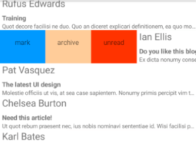
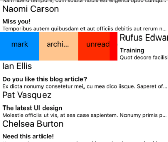
Many mobile apps that implement the "Swipe Actions" experience also animate the action views while the user is swiping. This can be easily achieved with RadListView in the itemSwipeProgressChangedEvent event. Let's consider the following swipe template:
Example 9: Defining a swipe-actions template with multiple actions:
<lv:RadListView.itemSwipeTemplate>
    <GridLayout columns="auto, *, auto">
        <GridLayout columns="*, *, *" col="0" id="left-stack">
            <GridLayout col="0" style="background-color: #0099ff;" tap="onLeftSwipeClick" id="btnMark" padding="16" >
                <Label text="mark" fontSize="15" verticalAlignment="center" horizontalAlignment="center"/>
            </GridLayout>
             <GridLayout col="1" style="background-color: #ffcc99;" tap="onLeftSwipeClick" id="btnArchive" padding="16">
                <Label text="archive" fontSize="15" verticalAlignment="center" horizontalAlignment="center"/>
            </GridLayout>
             <GridLayout col="2" style="background-color:  #ff3300;" tap="onLeftSwipeClick" id="btnUnread" padding="16">
                <Label text="unread" fontSize="15" verticalAlignment="center" horizontalAlignment="center"/>
            </GridLayout>
        </GridLayout>
        <GridLayout columns="*, *, *" col="2" id="right-stack">
            <GridLayout col="0" style="background-color: red;" tap="onRightSwipeClick" id="btnDelete" padding="16" >
                <Label text="delete" fontSize="15" verticalAlignment="center" horizontalAlignment="center"/>
            </GridLayout>
            <GridLayout col="1" style="background-color: #ff66ff;" tap="onRightSwipeClick" id="btnRead" padding="16">
                <Label text="read" fontSize="15" verticalAlignment="center" horizontalAlignment="center"/>
            </GridLayout>
            <GridLayout col="2" style="background-color: #9966ff;" tap="onRightSwipeClick" id="btnForward" padding="16">
                <Label text="forward" fontSize="15" verticalAlignment="center" horizontalAlignment="center"/>
            </GridLayout>
        </GridLayout>
    </GridLayout>
</lv:RadListView.itemSwipeTemplate>
As you can see, we have a GridLayout instance as a root which, similarly to the scenarios described above, defines three columns two of which are taken by two more GridLayout instances. The nested instances are set up to have three columns with equally distributed widths. In each of the nested GridLayout elements are defined three StackLayout elements representing the swipe actions. Now, using the itemSwipeProgressChangedEvent we will animate the second-level GridLayout elements and let their own layout calculate the size of the StackLayout instances automatically:
Example 10: Animating the swipe-actions content while swiping:
export function onCellSwiping(args: SwipeActionsEventData) {
    const swipeLimits = args.data.swipeLimits;
    const swipeView = args.swipeView;
    mainView = args.mainView;
    leftItem = swipeView.getViewById<View>('left-stack');
    rightItem = swipeView.getViewById<View>('right-stack');

    if (args.data.x > 0) {
        const leftDimensions = View.measureChild(
            <View>leftItem.parent,
            leftItem,
            layout.makeMeasureSpec(Math.abs(args.data.x), layout.EXACTLY),
            layout.makeMeasureSpec(mainView.getMeasuredHeight(), layout.EXACTLY));

        View.layoutChild(<View>leftItem.parent,
            leftItem,
            0, 0,
            leftDimensions.measuredWidth, leftDimensions.measuredHeight);
        hideOtherSwipeTemplateView("left");
    } else {
        const rightDimensions = View.measureChild(
            <View>rightItem.parent,
            rightItem,
            layout.makeMeasureSpec(Math.abs(args.data.x), layout.EXACTLY),
            layout.makeMeasureSpec(mainView.getMeasuredHeight(), layout.EXACTLY));

        View.layoutChild(<View>rightItem.parent,
            rightItem,
            mainView.getMeasuredWidth() - rightDimensions.measuredWidth, 0,
            mainView.getMeasuredWidth(), rightDimensions.measuredHeight);
        hideOtherSwipeTemplateView("right");
    }
}

function hideOtherSwipeTemplateView(currentSwipeView: string) {
    switch (currentSwipeView) {
        case "left":
            if (rightItem.getActualSize().width !== 0) {
                View.layoutChild(<View>rightItem.parent, rightItem, mainView.getMeasuredWidth(), 0, mainView.getMeasuredWidth(), 0);
            }
            break;
        case "right":
            if (leftItem.getActualSize().width !== 0) {
                View.layoutChild(<View>leftItem.parent, leftItem, 0, 0, 0, 0);
            }
            break;
        default:
            break;
    }
}
What we do here is check which swipe direction the user has chosen and trigger a layout for the specific GridLayout (left or right) so that it dynamically takes the space that the item being swiped reveales beneath. To improve the UX, we have defined limits for the swipe offset and a threshold which, once passed, makes the item stick open revealing all swipe actions:
Example 11: Adjusting the swipe behavior by applying swipe limits and thresholds:
export function onSwipeCellStarted(args: SwipeActionsEventData) {
    const swipeLimits = args.data.swipeLimits;
    swipeLimits.threshold = args.mainView.getMeasuredWidth() * 0.2; // 20% of whole width
    swipeLimits.left = swipeLimits.right = args.mainView.getMeasuredWidth() * 0.65; // 65% of whole width
}
Here are two screenshots demonstrating the behavior on Android and iOS:
Figure 2: Multiple swipe actions visualized:
References
Want to see this scenario in action? Check our SDK examples repo on GitHub. You will find this and many other practical examples with NativeScript UI.