Chart Bar Series
BarSeries are a type of CategoricalSeries that present categorical data with rectangular bars with heights or lengths proportional to the values that they represent. The bar chart usually shows comparisons among discrete categories but can also be used to visualize a trend in data over intervals of time.
Setup
To display a Bar Chart, you will need to:
- Add RadCartesianChart to your page.
- Set the chart's horizontalAxis to a category axis (CategoricalAxis, DateTimeCategoricalAxis or DateTimeContinuousAxis).
- Set the chart's verticalAxis to a value axis (LinearAxis or LogarithmicAxis).
-
Add at least one instance of BarSeries to the chart's series property and set its items property to a collection of data items, its categoryProperty set to the name of the property of the data items that will be used to determine their category and its valueProperty to the name of the property used to determine their value.
The above setup will create a chart with vertical bars. If you need horizontal bars, you can swap the axes' position and assign the category axis to the verticalAxis property and the value axis to the horizontalAxis property.
To illustrate this setup, let's create an example. First we will create a source with items:
Example 1: Define a source with data
get categoricalSource() {
    return [
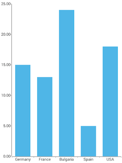
        { Country: "Germany", Amount: 15, SecondVal: 14, ThirdVal: 24 },
        { Country: "France", Amount: 13, SecondVal: 23, ThirdVal: 25 },
        { Country: "Bulgaria", Amount: 24, SecondVal: 17, ThirdVal: 23 },
        { Country: "Spain", Amount: 11, SecondVal: 19, ThirdVal: 24 },
        { Country: "USA", Amount: 18, SecondVal: 8, ThirdVal: 21 }
    ];
}
Note that since the bar chart shows categories, each category must be unique. In the above example, the category is 'Country'. Including the same category more than once would result in some data not being displayed.
We will use an instance of this model to assign it as the bindingContext of the page we have put our Bar series on:
Example 2: Update bindingContext
import { CategoricalDataModel } from "../../data-models/categorical-data-model";

export function onPageLoaded(args) {
    const page = args.object;
    page.bindingContext = new CategoricalDataModel();
}
And finally, in the XML definition of the page we put a RadCartesianChart, add a BarSeries instance to it and bind the series to the source of data:
Example 3: Add chart to page's markup
<navigation:ExamplePage xmlns:navigation="navigation/example-page" loaded="onPageLoaded"  xmlns:chart="nativescript-ui-chart" xmlns="http://www.nativescript.org/tns.xsd">
    <chart:RadCartesianChart id="cartesianChart">
        <chart:RadCartesianChart.horizontalAxis>
            <chart:CategoricalAxis/>
        </chart:RadCartesianChart.horizontalAxis>
        <chart:RadCartesianChart.verticalAxis>
            <chart:LinearAxis/>
        </chart:RadCartesianChart.verticalAxis>
        <chart:RadCartesianChart.series>
            <chart:BarSeries items="{{ categoricalSource }}" categoryProperty="Country" valueProperty="Amount"/>
        </chart:RadCartesianChart.series>
    </chart:RadCartesianChart>
</navigation:ExamplePage>
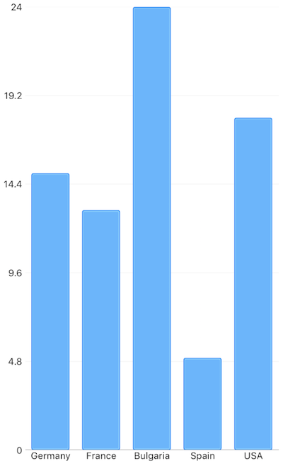
Figure 1: Chart with BarSeries on Android (left) and iOS (right)


Bar Size
By default, the size of a bar is calculated based on the axis plot mode and the count of the categories from the data source. There are cases in which the automatically calculated size does not meet the specific application scenarios. By using the minBarSize and maxBarSize properties you can adjust the size of a single bar within the series. The properties accept values in device independent pixels. These properties define boundaries for the size of a bar.
References
Want to see this scenario in action? Check our SDK examples repo on GitHub. You will find this and many other practical examples with NativeScript UI.
Examples used in this article:
Related articles you might find useful: