Chart Scatter Bubble Series
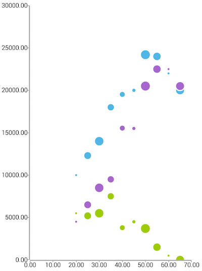
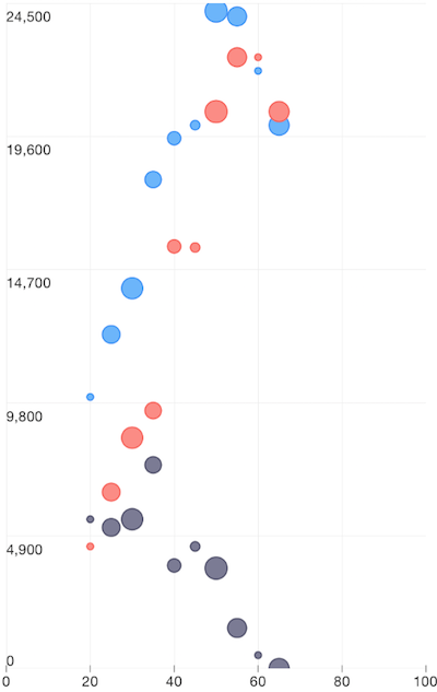
ScatterBubbleSeries are a type of CartesianSeries that use Cartesian coordinates to display values for typically two variables for a set of data. The data are displayed as a collection of bubble, each having the value of one variable determining the position on the horizontal axis and the value of the other variable determining the position on the vertical axis. Unlike ScatterSeries they can visualize a third value (on top of the two value properties) through the size of the bubbles. If you want to show bubbles for categorical data, you can use BubbleSeries.
Setup
To display a Scatter Bubble Chart, you will need to:
- Add a RadCartesianChart to your page.
- Set the chart's horizontalAxis to a category axis (CategoricalAxis, DateTimeCategoricalAxis or DateTimeContinuousAxis).
- Set the chart's verticalAxis to a value axis (LinearAxis or LogarithmicAxis).
- Add at least one instance of ScatterSeries to the chart's series property and set its items property to a collection of data items, the xProperty and yProperty to the names of the properties used to determine where to plot the scatter points and the bubbleSizeProperty to the name of the property used to determine the size of the bubble.
To illustrate this setup, let's create an example. First we will create a source with items:
Example 1: Define a source with data
get scatterSource() {
    return [
        { Age: 20, Salary: 10000, Spendings: 4500, Savings: 5500, Impact: 1 },
        { Age: 25, Salary: 12300, Spendings: 6500, Savings: 5200 , Impact: 7},
        { Age: 30, Salary: 14000, Spendings: 8500, Savings: 5500 , Impact: 10},
        { Age: 35, Salary: 18000, Spendings: 9500, Savings: 7500 , Impact: 6},
        { Age: 40, Salary: 19520, Spendings: 15540, Savings: 3800 , Impact: 4},
        { Age: 45, Salary: 20000, Spendings: 15500, Savings: 4500 , Impact: 2},
        { Age: 50, Salary: 24200, Spendings: 20500, Savings: 3700 , Impact: 11},
        { Age: 55, Salary: 24000, Spendings: 22500, Savings: 1500 , Impact: 8},
        { Age: 60, Salary: 22000, Spendings: 22500, Savings: 500 , Impact: 1},
        { Age: 65, Salary: 20000, Spendings: 20500, Savings: 10, Impact: 9 }
    ];
}
We use an instance of this model to assign it as the bindingContext of the page we have put our Scatter Bubble series on:
Example 2: Update bindingContext
import { ScatterDataModel } from "../../data-models/scatter-data-model";

export function onPageLoaded(args) {
    const page = args.object;
    page.bindingContext = new ScatterDataModel();
}
And finally, in the XML definition of the page we put a RadCartesianChart, add a ScatterBubbleSeries instance to it and bind the series to the source of data:
Example 3: Add chart to page's markup
<chart:RadCartesianChart>
        <chart:RadCartesianChart.horizontalAxis>
            <chart:LinearAxis/>
        </chart:RadCartesianChart.horizontalAxis>
        <chart:RadCartesianChart.verticalAxis>
            <chart:LinearAxis/>
        </chart:RadCartesianChart.verticalAxis>
    <chart:RadCartesianChart.series>
        <chart:ScatterBubbleSeries  items="{{ scatterSource }}" bubbleScale="5" xProperty="Age" yProperty="Salary" bubbleSizeProperty="Impact" />
        <chart:ScatterBubbleSeries  items="{{ scatterSource }}" bubbleScale="5" xProperty="Age" yProperty="Spendings" bubbleSizeProperty="Impact" />
        <chart:ScatterBubbleSeries  items="{{ scatterSource }}" bubbleScale="5" xProperty="Age" yProperty="Savings" bubbleSizeProperty="Impact" />
    </chart:RadCartesianChart.series>
</chart:RadCartesianChart>
Figure 1: Chart with ScatterBubbleSeries on Android (left) and iOS (right)


Bubble Scale
Additionally, ScatterBubbleSeries expose a bubbleScale property which can be used to fine-tune the size of the bubbles according to specific application requirements. The way the bubbleScale property works is by multiplying its value to the radius calculated for each data-point's bubble to determine the bubble's final size.
References
Want to see this scenario in action? Check our SDK examples repo on GitHub. You will find this and many other practical examples with NativeScript UI.
Examples used in this article:
Related articles you might find useful: