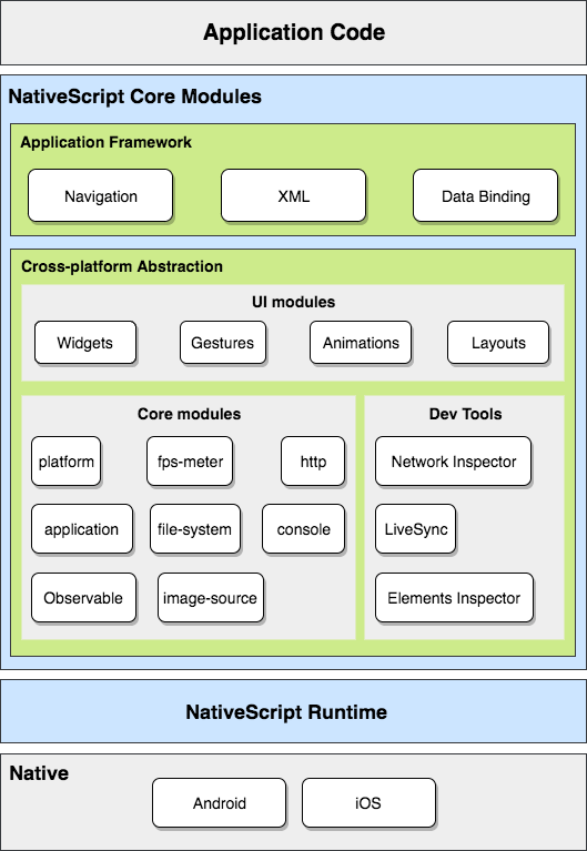
Using modules to access native device and platform capabilities
To let you access the native device and platform capabilities of your target platform, NativeScript uses a modular design pattern. All device, platform or user interface functionalities reside in separate modules. To access the functionality provided by a module, you need to require the module.

In your project, the files for each module reside in a dedicated subdirectory in the tns_modules directory. Each default module comes along with a package.json file that declares how the module should be called within your call and which file contains its respective code.
{ "name" : "button",
  "main" : "button.js" }
Core modules
- application: Provides the application abstraction with all related methods.
- console: Lets you print messages to the device console.
- application-settings: Lets you save and restore any information related to your application.
- http: Lets you send web requests and receive the responses.
-
image-source: Provides the
ImageSourceclass which encapsulates the common abstraction behind a platform-specific object that is used as a source for images (typically a Bitmap). - timer: Lets you create, start, stop and react to timers.
- trace: Lets you trace and print specific information based on categories.
-
ui/image-cache: Provides the
Cacheclass which handles image download requests and caches the already downloaded images. - connectivity: Lets you check the type of Internet connection and monitor its state changes.
Device functionality modules
- platform: Provides information about the device, its operating system and software.
- fps-meter: Lets you capture the frames-per-second metrics of your application.
- file-system: Lets you work with the device file system. Provides high-level abstractions for file system entities such as files, folders, known folders, paths, separators, etc.
-
ui/gestures: Provides the
GesturesObserverclass which lets you observe and respond to user gestures.
Data modules
-
data/observable: Provides the
Observableclass which represents an observable object or data in the MVVM paradigm. -
data/observable-array: Provides the
ObservableArrayclass which detects and responds to changes in a collection of objects. -
data/virtual-array: Provides the
VirtualArrayclass which is an advanced array-like class that helps loading items on demand.
User interface modules
-
ui/frame: Provides the
Frameclass which represents the logicalViewunit that is responsible for navigation within an application. -
ui/page: Provides the
Pageclass which represents a logical unit for navigation inside aFrame. NativeScript apps consist of pages. - color: Lets you create colors which you can use when you style the UI.
-
text/formatted-string: Provides the
FormattedStringandSpanclasses which you can use to create rich text formatted strings. -
xml: Provides the
XmlParserclass which is a SAX parser using the easysax implementation. -
ui/styling: Provides the
Styleclass which is responsible for the visual appearance of elements. -
ui/animation: Provides the
Animationclass which lets you animate view properties.
Layouts
-
ui/layouts/stack-layout: Provides the
StackLayoutclass which lets you arrange the children of the layout in a single line. -
ui/layouts/grid-layout: Provides the
GridLayoutclass which lets you arrange the children of the layout in a flexible grid area with columns and rows. -
ui/layouts/absolute-layout: Provides the
AbsoluteLayoutclass which lets you arrange the children of the layout at arbitrary positions or draw them in multiple layers. -
ui/layouts/wrap-layout: Provides the
WrapLayoutclass which lets you arrange the children of the layout at sequential positions from left to right and then wrap the lines of children from top to bottom. -
ui/layouts/dock-layout: Provides the
DockLayoutclass which lets you arrange the children of the layout at top, bottom, left and right of the layout.
Widgets
-
ui/activity-indicator: Provides the
ActivityIndicatorclass which represents a widget for showing that a service is currently busy. -
ui/button: Provides the
Buttonclass which is a standard button widget. -
ui/label: Provides the
Labelclass which is a standard label widget. -
ui/text-field: Provides the
TextFieldclass which represents an editable single-line box. -
ui/text-view: Provides the
TextViewclass which represents an editable multi-line line box. -
ui/list-view: Provides the
ListViewclass which represents a standard list view widget. -
ui/image: Provides the
Imageclass which represents an image widget. -
ui/progress: Provides the
Progressclass which represents a progress or loading indicator. -
ui/scroll-view: Provides the
ScrollViewclass which represents a scrollable area that can show content which is larger than the visible area. -
ui/search-bar: Provides the
SearchBarclass which represents a standard search bar component. -
ui/slider: Provides the
Sliderclass which represents a standard slider component. -
ui/switch: Provides the
Switchclass which represents a standard switch component. -
ui/tab-view: Provides the
TabViewclass which represents a standard content component with tabs. -
ui/web-view: Provides the
WebViewclass which represents a standard browser widget. -
ui/html-view: Provides the
HtmlViewclass which represents a standard html view widget. - ui/dialogs: Lets you show various dialogs such as alerts, prompts, confirmations and others.
-
ui/list-picker: Provides the
ListPickerclass which represents a standard list picker component. -
ui/date-picker: Provides the
DatePickerclass which represents a standard date picker component. -
ui/time-picker: Provides the
TimePickerclass which represents a standard time picker component. -
ui/placeholder: Provides the
Placeholderclass which lets you add a native widget to the visual tree.
WHATWG Polyfills
-
fetch: The
Fetchpolyfill that provides requests, responses, and the process that binds them: fetching. https://fetch.spec.whatwg.org/