Chart Spline Area Series
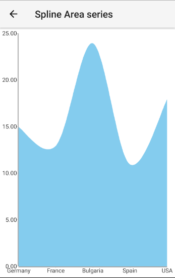
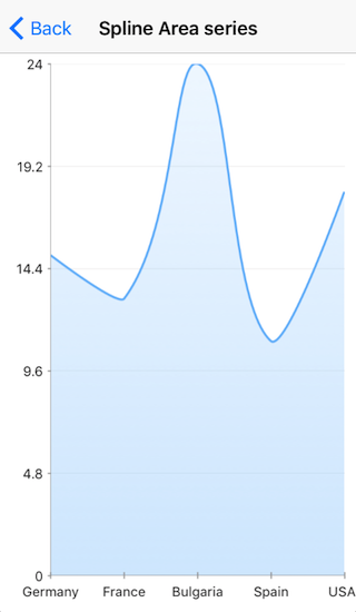
SplineAreaSeries are a type of CategoricalSeries that present categorical data as points connected with a spline, i.e. a curved line segments and then fill the area between the spline and the category axis. The spline area chart usually visualizes a trend in data over intervals of time, but can also be used to show comparisons among discrete categories.
Setup
To display a Line Chart, you will need to:
- Add a RadCartesianChart to your page.
- Set the chart's horizontalAxis to a category axis (CategoricalAxis, DateTimeCategoricalAxis or DateTimeContinuousAxis).
- Set the chart's verticalAxis to a value axis (LinearAxis or LogarithmicAxis).
- Add at least one instance of SplineAreaSeries to the chart's series property and set its items property to a collection of data items, its categoryProperty set to the name of the property of the data items that will be used to determine their category and its valueProperty to the name of the property used to determine their value.
To illustrate this setup, let's create an example. First we will create a source with items:
Example 1: Define a source with data
We use an instance of this model to assign it as the bindingContext of the page we have put our Spline Area series on:
Example 2: Update bindingContext
import { CategoricalDataModel } from "../../data-models/categorical-data-model";

export function onPageLoaded(args) {
    const page = args.object;
    page.bindingContext = new CategoricalDataModel();
}
Example 3: Add chart to page's markup
<navigation:ExamplePage xmlns:navigation="navigation/example-page" loaded="onPageLoaded" xmlns:chart="nativescript-ui-chart" xmlns="http://www.nativescript.org/tns.xsd">
    <chart:RadCartesianChart id="cartesianChart">
        <chart:RadCartesianChart.horizontalAxis>
            <chart:CategoricalAxis/>
        </chart:RadCartesianChart.horizontalAxis>
        <chart:RadCartesianChart.verticalAxis>
            <chart:LinearAxis/>
        </chart:RadCartesianChart.verticalAxis>
        <chart:RadCartesianChart.series>
            <chart:SplineAreaSeries items="{{ categoricalSource }}" categoryProperty="Country" valueProperty="Amount">
            </chart:SplineAreaSeries>
        </chart:RadCartesianChart.series>
    </chart:RadCartesianChart>
</navigation:ExamplePage>
Figure 1: Chart with SplineAreaSeries on Android (left) and iOS (right)


References
Want to see this scenario in action? Check our SDK examples repo on GitHub. You will find this and many other practical examples with NativeScript UI.
Examples used in this article:
Related articles you might find useful: