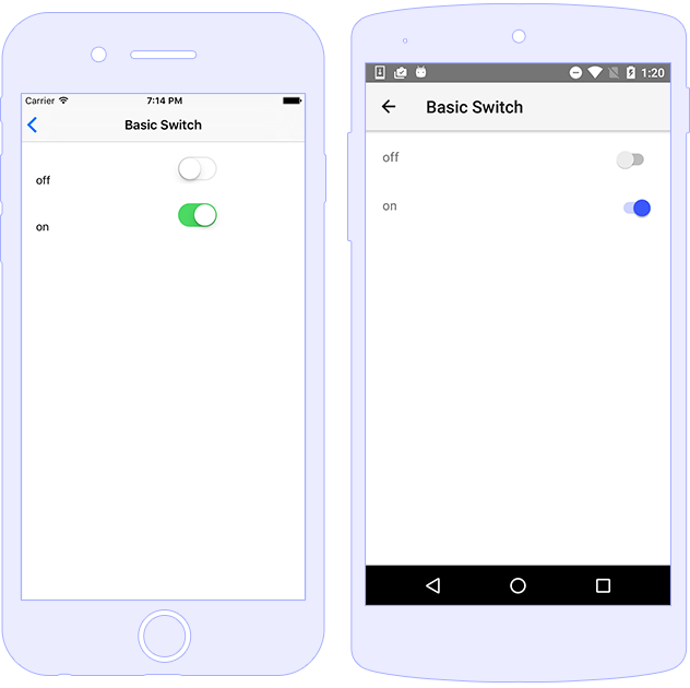
Switch
The Switch component allows users to toggle a control between two states.
The default state of the component is off, or false, however you can change the state by setting the checked property to a boolean value. To handle the state change event you can use the checkedChange property, which notifies the app when the value has changed.

Usage
<Switch checked="true" (checkedChange)="onCheckedChange($event)"></Switch>
import { Component } from "@angular/core";
import { EventData } from "tns-core-modules/data/observable";
import { Switch } from "tns-core-modules/ui/switch";

@Component({
    moduleId: module.id,
    templateUrl: "./usage.component.html"
})
export class BasicSwitchComponent {

    onCheckedChange(args: EventData) {
        let sw = args.object as Switch;
        let isChecked = sw.checked; // boolean
    }
}
Styling
The styling properties for the Swtich control are as follows:
-
color- Controls the handle color -
bacxgroundColor(background-colorin CSS) - Controls the background color while the switch is in ON state.-
offBackgroundColor(off-background-colorin CSS) - Controls the background color while the switch is in OFF state.
-
<!-- Styling via inline properties -->
<Switch color="yellow" backgroundColor="green" offBackgroundColor="red">
</Switch>
Note: When using
@nativescript/themethe default style will be set according to the used theme (no need to set additional CSS classes).
Properties
| Name | Type | Description |
|---|---|---|
checked |
boolean |
Gets or sets if a switch is checked or not. |
offBackgroundColor |
Color |
Gets or sets the off-state color. |
API References
| Name | Type |
|---|---|
| tns-core-modules/ui/switch | Module |
| Switch | Class |
Native Component
| Android | iOS |
|---|---|
| android.widget.Switch | UISwitch |