RadGauge Indicators
Indicators in RadGauge are visual elements that point to value or visualize a range of values on a GaugeScale. They should be added to a scale and their values are aligned to the scale the indicators belong to. Currently RadGauge supports bar and needle indicators.
Bar Indicators
Bar indicators are used to visualize a range of values on a scale. Customization of the bars is trivial. Changing their range, color, position and width is achieved by just setting a property. Bar indicators in RadGauge have a default animation that animates their maximum value. Below is an example how to create several RadialBarIndicator objects and add them to RadialScale. The example shows how to create and add the indicators in xml and then animate them when we navigate to the page. Note that the indicator's width and location are normalized values. They are calculated based on the size of the gauge.
Example 1. Add bar indicators to a scale
First you will need to setup the RadRadialGauge as described in the Indicators after that in order to add the RadialBarIndicator objects you will need to:
- Declare the
<RadialBarIndicator></RadialBarIndicator>and set the customtkRadialScaleIndicatorsinline directive to it. That inline directive is making the 'link' between theRadialBarIndicatorobject and theRadialScale
<RadRadialGauge class="gauge">
    <RadialScale #myScale tkRadialGaugeScales startAngle="0" sweepAngle="360" minimum="0" maximum="100" radius="0.9">
        <ScaleStyle tkRadialScaleStyle ticksVisible="false" labelsVisible="false" lineThickness="0"></ScaleStyle>

        <RadialBarIndicator tkRadialScaleIndicators minimum="0" maximum="100" location="0.5">
            <BarIndicatorStyle tkRadialBarIndicatorStyle fillColor="rgba(224,151,36,0.5)" barWidth="0.2"></BarIndicatorStyle>
        </RadialBarIndicator>

        <RadialBarIndicator tkRadialScaleIndicators minimum="0" maximum="0" location="0.5" isAnimated="true">
            <BarIndicatorStyle tkRadialBarIndicatorStyle cap="Round" fillColor="rgba(224,151,36,1)" barWidth="0.2"></BarIndicatorStyle>
        </RadialBarIndicator>

        <RadialBarIndicator tkRadialScaleIndicators minimum="0" maximum="100" location="0.75">
            <BarIndicatorStyle tkRadialBarIndicatorStyle fillColor="rgba(196,241,57,0.5)" barWidth="0.2"></BarIndicatorStyle>
        </RadialBarIndicator>

        <RadialBarIndicator tkRadialScaleIndicators minimum="0" maximum="0" location="0.75" isAnimated="true">
            <BarIndicatorStyle tkRadialBarIndicatorStyle cap="Round" fillColor="rgba(196,241,57,1)" barWidth="0.2"></BarIndicatorStyle>
        </RadialBarIndicator>

        <RadialBarIndicator tkRadialScaleIndicators minimum="0" maximum="100" location="1">
            <BarIndicatorStyle tkRadialBarIndicatorStyle fillColor="rgba(132,235,247,0.5)" barWidth="0.2"></BarIndicatorStyle>
        </RadialBarIndicator>

        <RadialBarIndicator tkRadialScaleIndicators minimum="0" maximum="0" location="1" isAnimated="true">
            <BarIndicatorStyle tkRadialBarIndicatorStyle cap="Round" fillColor="rgba(132,235,247,1)" barWidth="0.2"></BarIndicatorStyle>
        </RadialBarIndicator>
    </RadialScale>
</RadRadialGauge>.
import { Component, ViewChild, ElementRef, AfterViewInit } from "@angular/core";
import { RadialScale, RadialBarIndicator } from "nativescript-ui-gauge";

@Component({
    moduleId: module.id,
    selector: "tk-gauges-customization",
    templateUrl: "gauges-customization.component.html",
    styleUrls: ["gauges-customization.component.css"]
})
export class GaugesCustomizationComponent implements AfterViewInit {
    constructor() {
    }

    @ViewChild("myScale", { static: false }) scaleElement: ElementRef;

    ngAfterViewInit() {
        let scale = this.scaleElement.nativeElement as RadialScale;
        for (let i = 0; i < scale.indicators.length; i++) {
            let barIndicator = scale.indicators.getItem(i) as RadialBarIndicator;
            if (barIndicator.maximum === 0) {
                barIndicator.maximum = i * 15;
            }
        }
    }
}
.gauge {
    margin: 10;
}
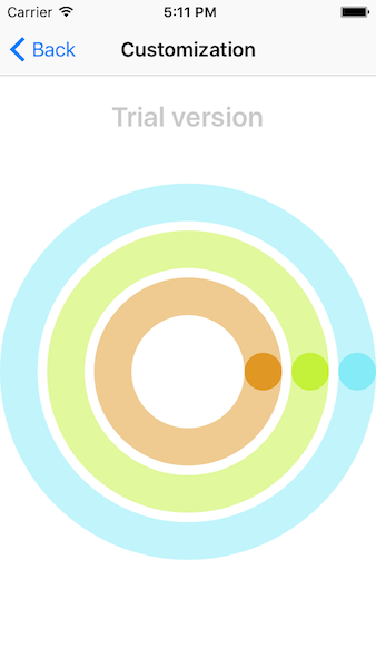
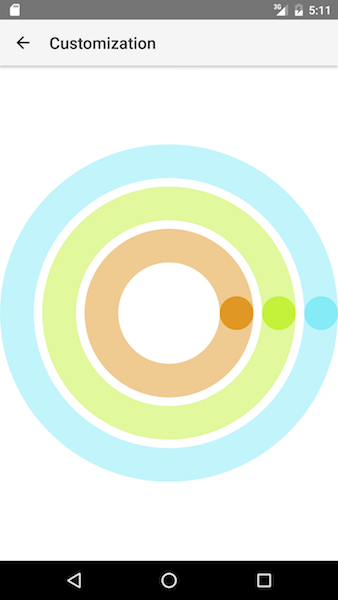
This is what you should see if you run the example now:
Figure 1. Radial gauge with bar indicators
Example 2. Animating the bar indicators
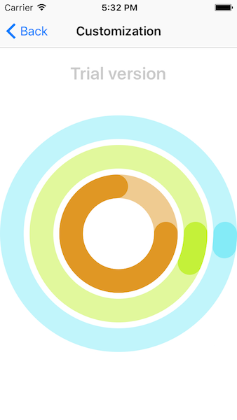
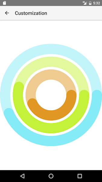
In order to animate the opaque indicators we have set the isAnimated property to true. The last thing to do is is to set their maximum value in the ngAfterViewInit handler and the indicators will animate to their new maximum value.
Figure 2. Bar indicators after animation
Needle Indicator
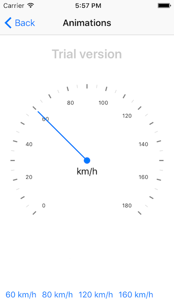
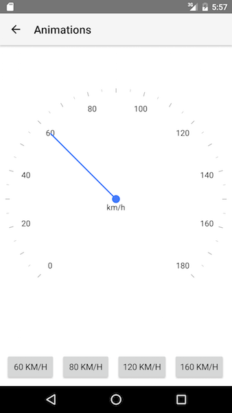
The needle indicator is used to point to a specific value. You can easily customize its length, top and bottom width. It is also possible to change the radius of the needle's circle or to offset the needle by just setting the corresponding properties. The length of the needle is again value between 0 and 1. The needle also supports animations when its value is changed. Adding a needle indicator to a scale is the same like adding a bar indicator.
Example 3. Add needle to a scale
<RadRadialGauge id="gaugeView" title="km/h" row="0" margin="10">
    <TitleStyle tkRadialGaugeTitleStyle textColor="black" ios:verticalOffset="20" android:verticalOffset="50"></TitleStyle>

    <RadialScale tkRadialGaugeScales minimum="0" maximum="180" radius="0.98">
        <ScaleStyle tkRadialScaleStyle lineThickness="0" labelsCount="10" majorTicksCount="19" minorTicksCount="1" ticksOffset="0.1"
            majorTicksStrokeWidth="2" majorTicksStrokeColor="rgb(132, 132, 132)"></ScaleStyle>
        <RadialBarIndicator tkRadialScaleIndicators minimum="0" maximum="60">
            <BarIndicatorStyle tkRadialBarIndicatorStyle fillColor="rgb(132, 132, 132)" barWidth="0.02"></BarIndicatorStyle>
        </RadialBarIndicator>

        <RadialBarIndicator tkRadialScaleIndicators minimum="61" maximum="120">
            <BarIndicatorStyle tkRadialBarIndicatorStyle fillColor="rgb(54, 54, 54)" barWidth="0.02"></BarIndicatorStyle>
        </RadialBarIndicator>

        <RadialBarIndicator tkRadialScaleIndicators minimum="121" maximum="180">
            <BarIndicatorStyle tkRadialBarIndicatorStyle fillColor="rgb(198, 85, 90)" barWidth="0.02"></BarIndicatorStyle>
        </RadialBarIndicator>

        <RadialNeedle #needle tkRadialScaleIndicators isAnimated="true" animationDuration="500">
            <NeedleStyle tkRadialNeedleStyle length="0.8" android:topWidth="8" android:bottomWidth="8" ios:topWidth="2" ios:bottomWidth="2"></NeedleStyle>
        </RadialNeedle>
    </RadialScale>
</RadRadialGauge>
import { Component, ViewChild, ElementRef, AfterViewInit } from "@angular/core";
import { RadialNeedle } from "nativescript-ui-gauge";

@Component({
    moduleId: module.id,
    selector: "tk-gauges-animations",
    templateUrl: "gauges-animations.component.html",
    styleUrls: ["gauges-animations.component.css"]
})
export class GaugesAnimationsComponent implements AfterViewInit {
    private _needle: RadialNeedle;
    public values = [60, 80, 120, 160];

    constructor() { }

    ngAfterViewInit() {
        this._needle = this.needleElement.nativeElement as RadialNeedle;
    }

    @ViewChild("needle", { static: false }) needleElement: ElementRef;

    public onValueChange(value: number) {
        this._needle.value = value;
    }
}
button {
    vertical-align: center;
    margin-bottom: 10;
}
Example 4. Animated the needle on button tap
After the needle is added to a scale and we have set its isAnimated property to true we can animate it changing its value when a button is tapped.
The example looks like this:
Figure 3. Needle indicator
References
Want to see this scenario in action? Check our SDK examples repo on GitHub. You will find this and many other practical examples with NativeScript UI.
Related articles you might find useful: