Chart Scatter Series
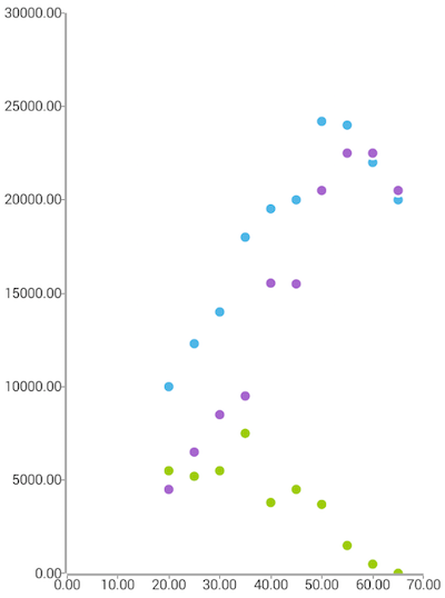
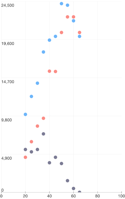
ScatterSeries are a type of CartesianSeries that use Cartesian coordinates to display values for typically two variables for a set of data. The data are displayed as a collection of points, each having the value of one variable determining the position on the horizontal axis and the value of the other variable determining the position on the vertical axis.
Setup
To display a Scatter Chart, you will need to:
- Add a RadCartesianChart to your page.
- Add a category axis (CategoricalAxis, DateTimeCategoricalAxis or DateTimeContinuousAxis) with the tkCartesianHorizontalAxis directive.
- Add a value axis (LinearAxis or LogarithmicAxis) with the tkCartesianVerticalAxis directive.
- Add at least one instance of ScatterSeries with the tkCartesianSeries directive and set its items property to a collection of data items and the xProperty and yProperty to the names of the properties used to determine where to plot the scatter points.
To illustrate this setup, let's create an example. Just like with all angular 'pages' let's start with the Component in which we will place our RadCartesianChart instance. We create a basic angular Component that contains a collection of objects provided by an custom service, which will be used by the chart to provide intuitive data visualization. The service is a simple 'mock' of an backend call that will return an array of objects:
Example 1: Define a data service
import { Injectable } from '@angular/core';

@Injectable()
export class DataService {
}
Inside that service we have a single function which returns an array:
Example 2: Define a source with data
getRangeBarSource(): Product[] {
    return [
        { Name: "Groceries", High: 30, Low: 12, Sales: 0, Margin: 0 },
        { Name: "Tools", High: 135, Low: 124, Sales: 0, Margin: 0 },
        { Name: "Electronics", High: 55, Low: 12, Sales: 0, Margin: 0 },
        { Name: "Gardening", High: 50, Low: 29, Sales: 0, Margin: 0 }
    ];
}
export class Product {
    constructor(public Name?: string, public High?: number, public Low?: number, public Sales?: number, public Margin?: number) {
    }
}
Example 3: Add chart to component's template
import { Component, OnInit } from '@angular/core';
import { DataService } from '../../data-services/data.service';
import { Person } from '../../data-services/person';
import { ObservableArray } from "tns-core-modules/data/observable-array";

@Component({
    moduleId: module.id,
    selector: 'tk-chart-series-scatter',
    providers: [DataService],
    templateUrl: 'chart-series-scatter.component.html'
})
export class ChartSeriesScatterComponent implements OnInit {
    private _scatterSource: ObservableArray<Person>;

    constructor(private _dataService: DataService) { }

    get scatterSource(): ObservableArray<Person> {
        return this._scatterSource;
    }

    ngOnInit() {
        this._scatterSource = new ObservableArray(this._dataService.getScatterSource());
    }
}
<RadCartesianChart tkExampleTitle tkToggleNavButton>
    <LinearAxis tkCartesianHorizontalAxis></LinearAxis>
    <LinearAxis tkCartesianVerticalAxis></LinearAxis>

    <ScatterSeries tkCartesianSeries [items]="scatterSource" xProperty="Age" yProperty="Salary"></ScatterSeries>
    <ScatterSeries tkCartesianSeries [items]="scatterSource" xProperty="Age" yProperty="Spendings"></ScatterSeries>
    <ScatterSeries tkCartesianSeries [items]="scatterSource" xProperty="Age" yProperty="Savings"></ScatterSeries>
</RadCartesianChart>
Figure 1: Chart with ScatterSeries on Android (left) and iOS (right)


References
Want to see this scenario in action? Check our SDK examples repo on GitHub. You will find this and many other practical examples with NativeScript UI.
Examples used in this article:
Related articles you might find useful: