Chart Negative Values
If you followed the getting started article, you now know how to create a chart and add it to a NativeScript page. In this article, you will see an example of using negative values and see how the chart will render them.
Getting Started
By default the LinearAxis supports the use of negative values. You can set the minimum minimum and/or the maximum to negative values.
Example 1: Using Negative Values
<RadCartesianChart tkExampleTitle tkToggleNavButton>
    <LinearAxis tkCartesianVerticalAxis allowZoom="true" minimum="-50" maximum="50"></LinearAxis>
    <CategoricalAxis tkCartesianHorizontalAxis allowZoom="true"></CategoricalAxis>

    <SplineAreaSeries tkCartesianSeries [items]="negativeValues" categoryProperty="Period" valueProperty="Amount"></SplineAreaSeries>
</RadCartesianChart>
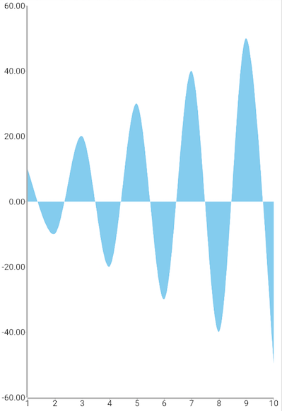
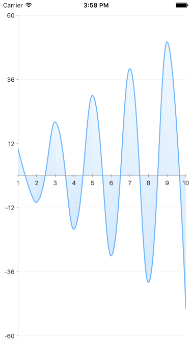
This is how the chart will look like with negative values on the Y axis:
Figure 1: Chart with negative values on Android (left) and iOS (right)


References
Want to see this scenario in action? Check our SDK Examples repository on GitHub. You will find this and many other practical examples with NativeScript UI.
Examples used in this article:
Related articles you might find useful: