RadDataForm Groups
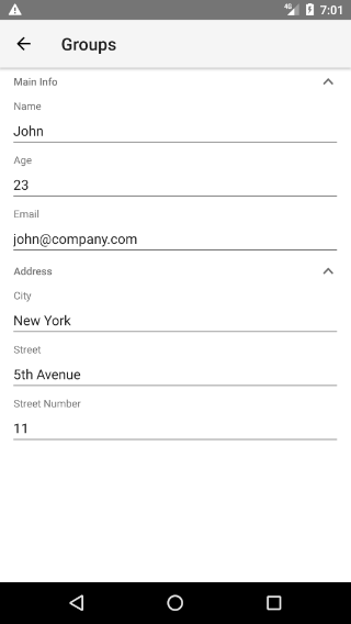
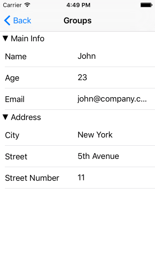
If you followed the getting started section, you now know how to edit an object's properties with RadDataForm for NativeScript. If your source object contains a lot of properties, it may be useful to show them in groups and optionally allow these groups to be collapsed. This article explains how.
Figure 1: Show the editors in groups in RadDataForm on Android (left) and iOS (right)


Add groups with HTML
Adding groups to RadDataForm and specifying which property belongs to each group is done very intuitively with the HTML. Instead of adding each TKEntityProperty to RadDataForm directly with the tkDataFormProperty directive, we add groups to RadDataForm and the we add each EntityProperty to its own group with the tkPropertyGroupProperties. The following example demonstrates how.
Example 1: Add groups to RadDataForm
<TKPropertyGroup tkDataFormGroups collapsible="true" name="Main Info" hidden="false">
    <TKEntityProperty tkPropertyGroupProperties name="name">
        <TKPropertyEditor tkEntityPropertyEditor type="Text"></TKPropertyEditor>
    </TKEntityProperty>
    <TKEntityProperty tkPropertyGroupProperties name="age">
        <TKPropertyEditor tkEntityPropertyEditor type="Number"></TKPropertyEditor>
    </TKEntityProperty>
    <TKEntityProperty tkPropertyGroupProperties name="email">
        <TKPropertyEditor tkEntityPropertyEditor type="Email"></TKPropertyEditor>
    </TKEntityProperty>
</TKPropertyGroup>
Groups Adjustments
Note the collapsible property of the PropertyGroup in the previous example. This allows you to specify whether the groups can be collapsed by tapping on their header. You can use the collapsed property to control the current state of the group. If you want to hide the header, you can use PropertyGroup's titleHidden property. To hide the whole group, you can use PropertyGroup's hidden property. If you need to make changes to some of the properties of a PropertyGroup, you can get it by its name through getGroupByName method and make your changes:
- First we will need to pass the RadDataForm instance to the Angular
@Component. We can easily do that via the@ViewChildmechanism, thedataformAngularModuleis thenativescript-ui-dataform/angularmodule:
Example 2: Access the RadDataFormComponent
<RadDataForm #myRuntimeDataFormComp [source]="person" row="1">
@ViewChild('myRuntimeDataFormComp', { static: false }) myRuntimeDataFormComp: RadDataFormComponent;
- This will inject the
RadDataFormComponentinto themyRuntimeDataFormCompproperty. In order to access theRadDataFormelement simply use thedataFormproperty:
Example 3: Adjust group's property through code
public changeGroupLabelTextColor() {
    const group = this.myRuntimeDataFormComp.dataForm.getGroupByName("Main Info");
    group.titleStyle.labelTextColor = new Color("Blue");
}
Events
RadDataForm provides the following group related events:
- groupUpdate - fired when the a group is being setup and can be used for customizations of the native groups
- groupExpanded and groupCollapsed - to notify you when a group is collapsed or expanded, if the group supports collapsing.
These events provide event arguments which have a property groupName which you can use to determine the name of the group related with the event and a property group, which can be used to get the native group element.
Add groups with JSON
If you are using JSON metadata to setup the RadDataForm, you can also apply grouping to the properties. Just add groupName to each property inside the propertyAnnotations array.
Example 4: Sample JSON metadata for RadDataForm
{
    "propertyAnnotations":
    [
        {
            "name": "city",
            "index": 3,
            "groupName": "Address",
            "editor": "Picker",
            "valuesProvider": ["New York", "Washington", "Los Angeles"]
        },
        {
            "name": "street",
            "index": 4,
            "groupName": "Address"
        },
        {
            "name": "streetNumber",
            "index": 5,
            "editor": "Number",
            "groupName": "Address"
        },
        {
            "name": "age",
            "index": 1,
            "editor": "Number",
            "groupName": "Main Info"
        },
        {
            "name": "email",
            "index": 2,
            "editor": "Email",
            "groupName": "Main Info"
        },
        {
            "name": "name",
            "index": 0,
            "groupName": "Main Info"
        }
    ]
}
Please note that the groups are created this way, are not available for the getGroupByName method.
In order to achieve the same look as the group in the above image, we need to also make the new groups collapsible. This can be done through the native groups that are accessible through the groupUpdate event:
public onGroupUpdate(args) {
    if (ios) {
        let nativeGroup: TKEntityPropertyGroupView = args.group;
        nativeGroup.collapsible = true;
    } else {
        let nativeGroup: com.telerik.widget.dataform.visualization.ExpandableEditorGroup = args.group;
        nativeGroup.setExpandable(true);
    }
}
References
Want to see these scenarios in action? Check our SDK Examples for Angular repo on GitHub. You will find this and many other practical examples with NativeScript UI.
Related articles you might find useful: