RadDataForm Editors List
If you followed the getting started section, you now know how to edit an object's properties with RadDataForm for NativeScript. The editors overview page outlined the main features of the editors in RadDataForm. This article will demonstrate the supported editors and show you how to use them.
Complete List
Here's the full list of the editors supported in RadDataForm:
-
Text: Simple text input. -
MultilineText: Text input, which supports more than one line. -
Email: Again for text input, with email optimized keyboard. -
Password: Masks the entered text. -
Phone: Again for text input, with phone optimized keyboard. -
Number: For input of numbers from the keyboard. -
Decimal: For input of numbers from the keyboard, supports decimal values. -
Switch: For boolean values. -
Stepper: For choosing a number by tapping on buttons to increase or decrease it. -
Slider: For choosing a number by sliding between the minimum and maximum values. -
Picker: For picking a value from a predefined list (drop-down list). -
SegmentedEditor: For picking a value from a predefined list (horizontal list). -
List: For picking a value from a predefined list (vertical list). -
DatePicker: For picking a date from a calendar. -
TimePicker: For picking a time from a clock. -
AutoCompleteInline: For picking single or multiple items from a suggestion list. -
Label: For simply displaying the property value inside a non-editable label.
Editors by Usage
Here's more about each of the supported editors based on their common usage:
Simple Text
The following editors can be used for properties of type string:
-
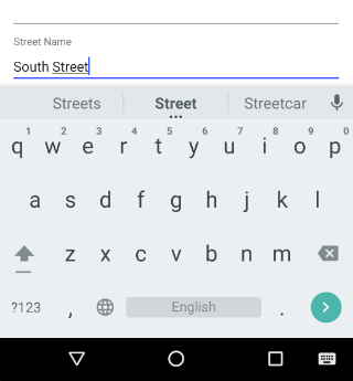
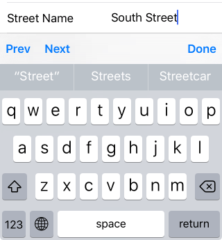
Text: Provides text input with the default keyboard. It is default for properties of type
string.
Figure 1: Text editor on Android (left) and iOS (right)
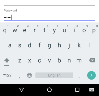
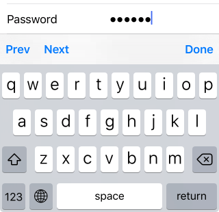
- Password: Masks the entered text.
Figure 2: Password editor on Android (left) and iOS (right)
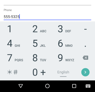
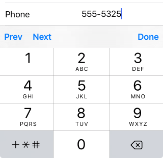
- Phone: Uses phone optimized keyboard.
Figure 3: Phone editor on Android (left) and iOS (right)
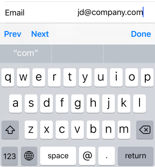
- Email: Uses email optimized keyboard.
Figure 4: Email editor on Android (left) and iOS (right)

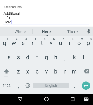
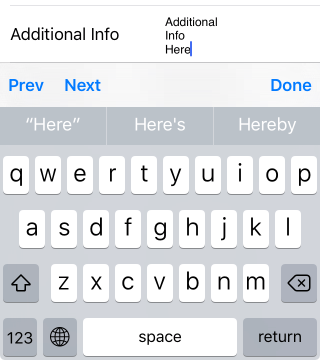
- MultilineText: Supports more than one line.
Figure 5: MultilineText editor on Android (left) and iOS (right)
Numeric
The following editors can be used for properties of type number:
-
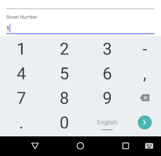
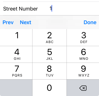
Number: For input of numbers from the keyboard. It is default for
numberproperties on Android.
Figure 6: Number editor on Android (left) and iOS (right)
-
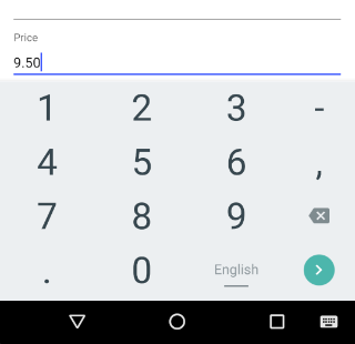
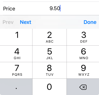
Decimal: For input of numbers from the keyboard, supports decimal values. It is default for floating-point
numberproperties on Android.
Figure 7: Decimal editor on Android (left) and iOS (right)
-
Stepper: For choosing a number by tapping on buttons to increase or decrease it. It is default for
numberproperties on iOS.
Figure 8: Stepper editor on Android (left) and iOS (right)


-
Slider: For choosing a number by sliding between the minimum and maximum values. It is default for floating-point
numberproperties on iOS.
Figure 9: Slider editor on Android (left) and iOS (right)


True or False
-
Switch: Uses a switch to get true/false input. It is default for
booleanproperties on iOS.
Figure 10: Switch editor on Android (left) and iOS (right)


Note that on Android the default editor for
booleanproperties is CheckBox which is not supported on iOS.
Date and Time
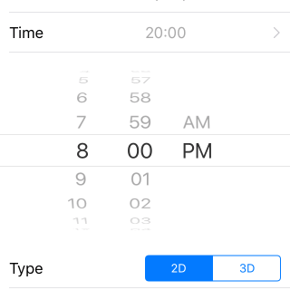
The DatePicker and TimePicker editors can be used to pick a date or time. They support values of type Date and values of type string in the following formats: yyyy-MM-dd for DatePicker and HH:mm for TimePicker. The value that is committed when edited with these editors will be in the same format as the initial value of the edited property. If the initial value is null or is of type Date, then the committed value will be of type Date. If the initial value is ”” (empty string or string in the supported formats), the committed value will be string in the supported formats.
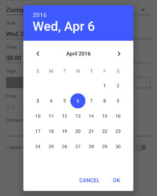
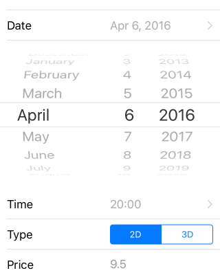
- DatePicker: For picking a date from a calendar.
Figure 11: DatePicker editor on Android (left) and iOS (right)
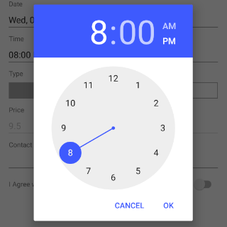
- TimePicker: For picking a time from a clock.
Figure 12: TimePicker editor on Android (left) and iOS (right)
Input from Predefined Lists
The following editors can be used for properties of any type but they need to have their acceptable values defined through a value provider. Here's an article with more information about the value providers.
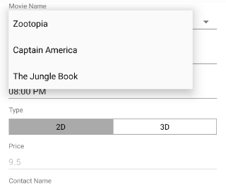
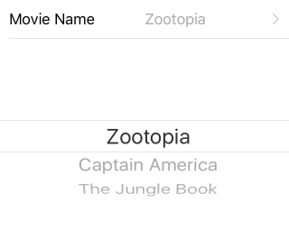
- Picker: For picking a value from a drop-down list.
Figure 13: Picker editor on Android (left) and iOS (right)
- SegmentedEditor: For picking a value from a horizontal list.
Figure 14: SegmentedEditor editor on Android (left) and iOS (right)


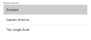
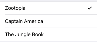
- List: For picking a value from a vertical list.
Figure 15: List editor on Android (left) and iOS (right)
Input with AutoComplete Suggestions
- AutoCompleteInline: For text input with option to choose single or multiple items from a suggestions list.
Figure 16: AutoCompleteInline editor in Tokens mode on Android (left) and iOS (right)
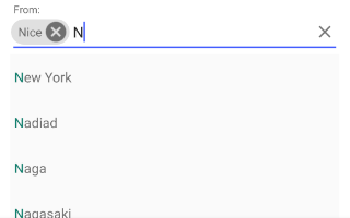
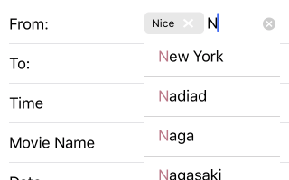
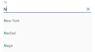
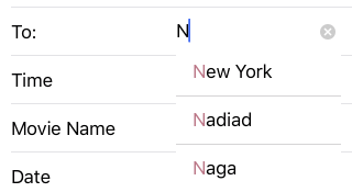
This editor also uses a predefined list with values, but they are not the only acceptable values, but rather they are suggestions that are displayed when the user starts typing for the keyboard. There are two modes: Plain and Tokens. The desired mode should be set to the autoCompleteDisplayMode property of the EntityProperty. The Plain mode can be used for string properties, while the Tokens mode can be used for properties of type string[]. The next code snippet shows how you can setup the AutoCompleteInline editor. The source object is of type Booking and has two properties: from and to. The from property is of type Array<String> and we use the AutoCompleteInline editor with Tokens display mode, which allows us to select multiple items from our suggestions. The to property is of type string and we use the AutoCompleteInline editor with Plain display mode which allows us to type a simple text.
Example 1: Use the AutoCompletInline editor in Plain and in Token modes
<RadDataForm #dataform row="1" [source]="booking" tkExampleTitle tkToggleNavButton (propertyCommitted)="onPropertyCommitted($event)">
    <TKEntityProperty tkDataFormProperty name="from" displayName="From:" index="0" autoCompleteDisplayMode="Tokens" [valuesProvider]="fromProviders">
        <TKPropertyEditor tkEntityPropertyEditor type="AutoCompleteInline"></TKPropertyEditor>
    </TKEntityProperty>

    <TKEntityProperty tkDataFormProperty name="to" displayName="To:" index="1" autoCompleteDisplayMode="Plain" valuesProvider="New York, Washington, Los Angeles">
        <TKPropertyEditor tkEntityPropertyEditor type="AutoCompleteInline"></TKPropertyEditor>
    </TKEntityProperty>
</RadDataForm>
Figure 17: AutoCompleteInline editor in Plain mode on Android (left) and iOS (right)
View Only
- Label: For simply displaying the property value inside a non-editable label.
Figure 18: Label editor on Android (left) and iOS (right)


Custom Editors
If an editor that you would like to use is not included in the list with predefined editors, you can provide your own native view that will be used with the existing editor logic. You can read more here.
References
Want to see this scenario in action? Check our SDK Examples for Angular repo on GitHub. You will find theis and many other practical examples with NativeScript UI.
Related articles you might find useful: