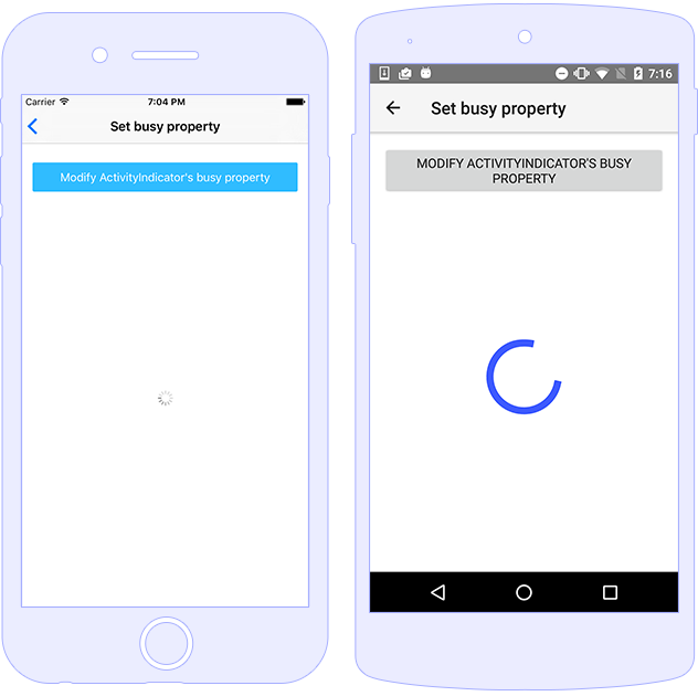
The ActivityIndicator represents a UI widget which displays a progress indicator hinting the user for some background operation running like loading image, data, accepting a request, etc. You can control its behavior by setting or binding to its busy property.

You can work with its boolean busy property and set it to true or false, thus displaying or hiding the control.
<ActivityIndicator [busy]="isBusy" (busyChange)="onBusyChanged($event)"></ActivityIndicator>
import { Component } from "@angular/core";
import { ActivityIndicator } from "tns-core-modules/ui/activity-indicator";
import { EventData } from "tns-core-modules/data/observable";

@Component({
    moduleId: module.id,
    templateUrl: "./usage.component.html"
})
export class ActivityIndicatorUsageComponent {
    isBusy: boolean = true;

    onBusyChanged(args: EventData) {
        let indicator: ActivityIndicator = <ActivityIndicator>args.object;
        console.log("indicator.busy changed to: " + indicator.busy);
    }
}
Improve this document
Demo Source
The ActivityIndicator supports styling the color (default value is blue) and backgroundColor (default value is transparent) properties.
<ActivityIndicator busy="true" color="red" width="100" height="100"></ActivityIndicator>
|
@nativescript/theme CSS class |
Description |
activity-indicator |
Styles the color of the indicator in sync with the main theme color. |
Improve this document
Demo Source
| Name |
Type |
Description |
busy |
boolean |
Gets or sets a value indicating whether the widget is currently displaying progress. |
| Name |
Description |
busyChange |
Emitted when the ActivityIndicator busy property is changed. |
loaded |
Emitted when the view is loaded. |
unloaded |
Emitted when the view is unloaded. |
layoutChanged |
Emitted when the layout bounds of a view changes due to layout processing. |
