RadListView Item Layouts
Often there are cases when you need to display your list of items in non-linear layout. For examples, you may want to have a grid of items. For that purpose, RadListView defines three types of item layouts which are fully UI virtualized and optimized for mobile. The following layout types are available:
- Linear layout - this is the most common layout used with a RadListView component. Items are ordered horizontally or vertically one at a time.
- Grid layout - this is a layout in which items are ordered in columns and rows. Depending on the scrolling orientation (vertical or horizontal), the amount of columns or rows is predefined.
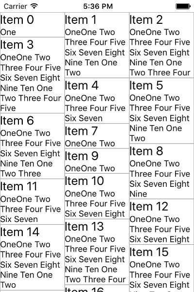
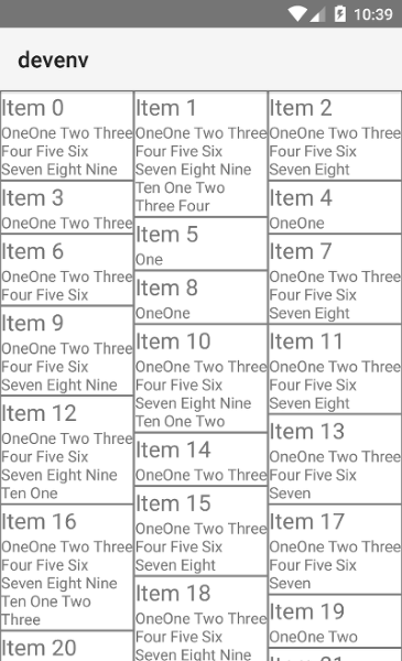
- Staggered layout - this is a fancier version of the Grid layout where items are also ordered in rows or columns depending on the scrolling direction whereas no free spaces are preserved between neighboring items in the direction of scrolling.
Defining a Specific Item Layout
RadListView exposes the listViewLayout property which accepts objects inheriting from ListViewLayoutBase. Currently the following classes are available:
Each layout object exposes itemHeight and itemWidth properties which can be used to explicitly define the size of the items. Note that these properties do not always work depending on the layout type currently used, as well as on the platform (Android or iOS).
Using ListViewLinearLayout
Setting a ListViewLinearLayout is done by declaring the ListViewLinearLayout and setting the tkListViewLayout:
<ListViewLinearLayout tkListViewLayout scrollDirection="Vertical" itemInsertAnimation="Default" itemDeleteAnimation="Default"></ListViewLinearLayout>
The
itemHeightanditemWidthproperties are iOS specific. If not used, items are sized dynamically depending on the data coming from the source.
ListViewLinearLayoutexposes thedynamicItemSizeproperty which, when set tofalse, makes the layout use theitemHeightanditemWidthproperties thus making all items have fixed height. This improves the scrolling performance on iOS.
Using 'ListViewGridLayout'
Setting a ListViewGridLayout is done by declaring the ListViewGridLayout and setting the tkListViewLayout:
<ListViewGridLayout tkListViewLayout scrollDirection="Vertical" ios:itemHeight="250" dynamicItemSize="false" spanCount="2"></ListViewGridLayout>
Setting the spanCount property to a number will make the ListViewGridLayout order the items in three columns or rows depending on the scrolling direction. You can also use the itemHeight and itemWidth properties here for size tuning.
Using 'ListViewStaggeredLayout'
Setting a ListViewStaggeredLayout is done by declaring the ListViewStaggeredLayout and setting the tkListViewLayout:
<ListViewStaggeredLayout tkListViewLayout scrollDirection="Vertical" spanCount="3"></ListViewStaggeredLayout>
Defining an explicit item size here is not needed since the essence of a staggered layout is that items are freely measured and positioned according to their desired size as shown on the pictures below. Also note the second Label in the itemTemplate which enables text-wrapping for its content to allow for arbitrary item size depending on the length of the text. The result is visible on the pictures below:

