RadListView Item Separators
This tutorial describes how to add separators between the items in RadListView.
Item separators are lines displayed between the items to better designate the bounds each item occupies within the scrollable list. Item separators are currently not supported as an out-of-the-box feature by RadListView but there is an easy way to implement this behavior which is described in this article.
Implementing Item Separators in RadListView
- Create an angular Component in your NativeScript application and put a
RadListViewinstance bound to a source of data items - Add a new
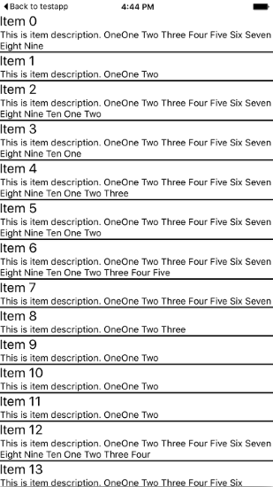
StackLayoutinstance in thetkListItemTemplateand make its height be 2 pixels as shown below: - Run your application. The result should be as the following screenshot demonstrates
<GridLayout tkExampleTitle tkToggleNavButton>
    <RadListView [items]="dataItems">
        <ng-template tkListItemTemplate let-item="item">
            <StackLayout orientation="vertical">
                <Label class="nameLabel" [text]="item.name"></Label>
                <Label class="descriptionLabel" [text]="item.description"></Label>
                <StackLayout height="2" backgroundColor="Black"></StackLayout>
            </StackLayout>
        </ng-template>
    </RadListView>
</GridLayout>

Conclusion
Item separators are easily implementable in RadListView by adding an element within your template with the corresponding dimensions and color. Separation between items in RadListView can also be implemented by using a margin by setting the marginBottom to the root layout in the tkListItemTemplate.