RadGauge Overview
RadGauge is a highly customizable component that allows you to show the current status of a value within a range of upper and lower bounds, illustrate progress towards a goal or a summary of a fluctuating metric.
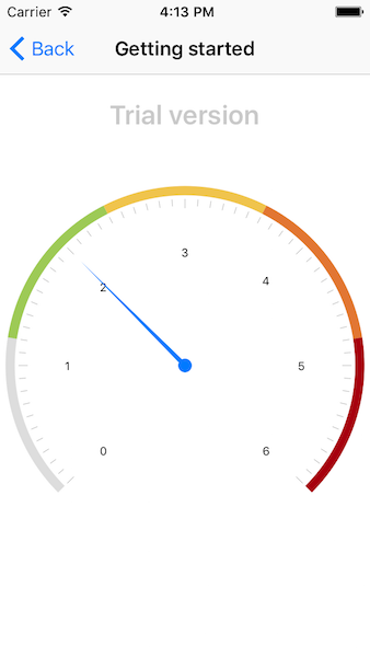
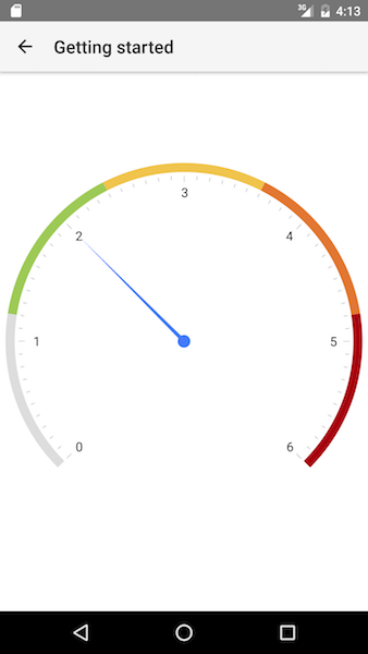
Figure 1: Radial gauge with indicators


Scales
RadGauge supports multiple GaugeScale objects. The scale has range and a set of indicators that are rendered according to the scale's range.
Indicators
GaugeIndicator is a visual element that points to or visualizes a range of values on a scale. Multiple indicators can be added to a scale. Indicators can be animated when their value is changed.
Angular directives
When using the RadGauge with Angular you are going to work with multiple custom angular RadGauge specific directives. In short these directives are used by the angular framework to enable 'linking' between separate HTML tags into one 'complex' element.
Here is a full list of the available custom Angular RadGauge directives and components:
Components
Represent the major elements:
| Selector | Class (more details) |
|---|---|
| RadRadialGauge | RadRadialGaugeComponent |
Directives
Represent the smaller elements that are visualized in RadListView:
| Selector | Class (more details) |
|---|---|
| RadialScale | TKRadialScaleDirective |
| RadialBarIndicator | TKRadialBarIndicatorDirective |
| RadialNeedle | TKRadialNeedleDirective |
Inline Directives
Represent the 'link' mechanism of the smaller with the major elements
| Selector | Class (more details) |
|---|---|
| tkRadialGaugeScales | TKRadialGaugeScalesDirective |
| tkRadialScaleIndicators | TKRadialScaleIndicatorsDirective |
| tkRadialBarIndicatorStyle | TKRadialBarIndicatorStyleDirective |
| tkRadialGaugeTitleStyle | TKRadialGaugeTitleStyleDirective |
| tkRadialGaugeSubtitleStyle | TKRadialGaugeSubtitleStyleDirective |
| tkRadialNeedleStyle | TKRadialNeedleStyleDirective |