Chart Getting Started
In this article, you will learn to start using NativeScript UI Chart: how to initialize the chart, how to create the data series and how to use the different axes. The code snippets from this section are available as a standalone demo application.
Plugin Installation
Run the following command to add the plugin to your application:
tns plugin add nativescript-ui-chart
Add Chart to Component Template
Before proceeding, make sure that the NativeScriptUIChartModule from the nativescript-ui-chart plugin has been imported in an ngModule in your app. For example:
import { NativeScriptUIChartModule } from "nativescript-ui-chart/angular";
@NgModule({
    schemas: [NO_ERRORS_SCHEMA],
    imports: [
        ....
        NativeScriptUIChartModule,
        ....
    ],
    declarations: [
        ....
    ]
})
export class ChartExamplesModule { }
Let's start with the Component in which we will place our RadChart instance. We create a basic angular Component that contains a collection of objects provided by an custom service, which has two properties that will be used by the chart to provide intuitive data visualization.
The service is a simple 'mock' of an backend call that will return an array of objects. Inside that service we have a single function which returns an array:
Example 1: Define a source with data
import { Injectable } from '@angular/core';

@Injectable()
export class DataService {
}
getCategoricalSource(): Country[] {
    return [
        { Country: "Germany", Amount: 15, SecondVal: 14, ThirdVal: 24, Impact: 0, Year: 0 },
        { Country: "France", Amount: 13, SecondVal: 23, ThirdVal: 25, Impact: 0, Year: 0 },
        { Country: "Bulgaria", Amount: 24, SecondVal: 17, ThirdVal: 23, Impact: 0, Year: 0 },
        { Country: "Spain", Amount: 11, SecondVal: 19, ThirdVal: 24, Impact: 0, Year: 0 },
        { Country: "USA", Amount: 18, SecondVal: 8, ThirdVal: 21, Impact: 0, Year: 0 }
    ];
}
export class Country {
    constructor(public Country?: string, public Amount?: number, public SecondVal?: number, public ThirdVal?: number, public Impact?: number, public Year?: number) {
    }
}
Initialization
The next step is to add the chart to the template of your Component. In this case we will use the RadCartesianChart type. For an example with RadPieChart you can refer to the PieSeries article
Charts must be put in a parent layout panel that does not require from its children to have their own desired size. You should not therefore put your chart in a
StackLayoutor an auto-sized row within aGridLayout.
After adding the chart to the page we need to add the series we will use in order to show the chart. In this case we will use the BarSeries in combination with a Categorical axis and a Linear axis. We set the categoryProperty of the series to the Country property in the objects from our data model and the valueProperty to the Amount property.
Then we set the tkCartesianHorizontalAxis directive to an instance of a CategoricalAxis and the tkCartesianVerticalAxis directive to an instance of a LinearAxis.
After the axes are set we need to add the series which we will show in the chart. In this case we will use the BarSeries. We need to declare the BarSeries between the RadCartesianChart open and close tags and set the tkCartesianSeries directive.
The DataService and Country are custom modules used for example purposes so make sure you import them accordingly from your project's folder structure.
Example 2: Code of component
import { Component, OnInit } from '@angular/core';
import { DataService } from '../../data-services/data.service';
import { Country } from '../../data-services/country';
import { ObservableArray } from "tns-core-modules/data/observable-array";

@Component({
    moduleId: module.id,
    selector: 'tk-chart-series-line',
    providers: [DataService],
    templateUrl: 'chart-series-line.component.html'
})
export class ChartSeriesLineComponent implements OnInit {
    private _categoricalSource: ObservableArray<Country>;

    constructor(private _dataService: DataService) { }

    get categoricalSource(): ObservableArray<Country> {
        return this._categoricalSource;
    }

    ngOnInit() {
        this._categoricalSource = new ObservableArray(this._dataService.getCategoricalSource());
    }
}
<RadCartesianChart tkExampleTitle tkToggleNavButton>
    <CategoricalAxis tkCartesianHorizontalAxis></CategoricalAxis>
    <LinearAxis tkCartesianVerticalAxis></LinearAxis>
    <LineSeries tkCartesianSeries [items]="categoricalSource" categoryProperty="Country" valueProperty="Amount"></LineSeries>
</RadCartesianChart>
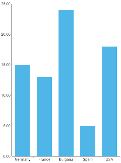
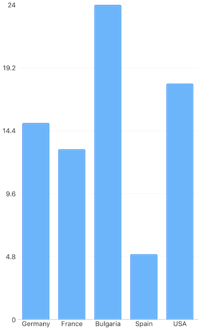
This will produce a page showing a Chart that will look like this:
Figure 1: Chart with BarSeries on Android (left) and iOS (right)


References
Want to see this scenario in action? Check our SDK Examples repository on GitHub. You will find this and many other practical examples with NativeScript UI.
Examples used in this article:
Related articles you might find useful: