RadSideDrawer Getting Started
This article explains how to create a simple RadSideDrawer with Angular. The code snippets from this section are available as a standalone demo application.
The
RadSideDraweris designed to be placed as a single child in your component's HTML. This rule excludes the use of a<ActionBar>which is not treated as a simple element by NativeScript and can be used withRadSideDrawerby placing it at the beginning of the HTML. For example:<ActionBar></ActionBar> <!-- ActionBar can be used with RadSideDrawer on the root level --> <RadSideDrawer></RadSideDrawer> <!-- RadSideDrawer should be single child (not counting ActionBar)--> <!-- It is NOT allowed to have other elements on the root level with RadSideDrawer <StackLayout></StackLayout> -->
Installation
Run the following command to add the plugin to your application:
tns plugin add nativescript-ui-sidedrawer
Initialization
Before proceeding, make sure that the NativeScriptUISideDrawerModule from the nativescript-ui-sidedrawer plugin has been imported in an ngModule in your app. For example:
import { NativeScriptUISideDrawerModule } from "nativescript-ui-sidedrawer/angular";
@NgModule({
    schemas: [NO_ERRORS_SCHEMA],
    imports: [
        ....
        NativeScriptUISideDrawerModule,
        ....
    ],
    declarations: [
        ....
    ]
})
export class SideDrawerExamplesModule { }
Demo.
The RadSideDrawer consists of two visual parts:
-
mainContent- the visual elements displayed in the host view where the drawer is shown. -
drawerContent- the visual elements displayed in the side drawer.
Defining mainContent and drawerContent with Angular is done with the corresponding directives:
-
TKMainContent- used with thetkMainContentselector -
TKDrawerContent- used with thetkDrawerContentselector
The following code snippet is a simple template with a basic setup for RadSideDrawer.
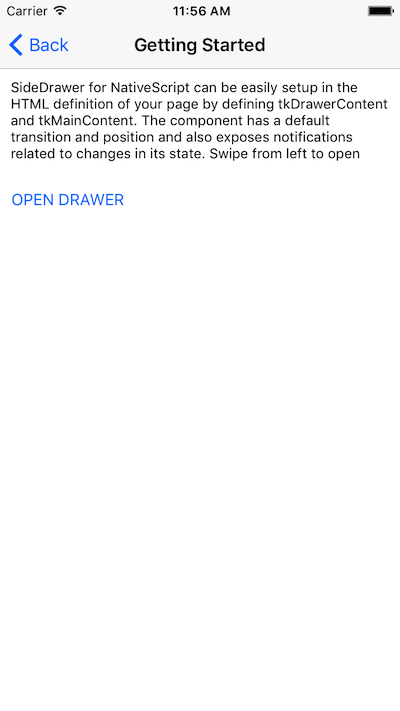
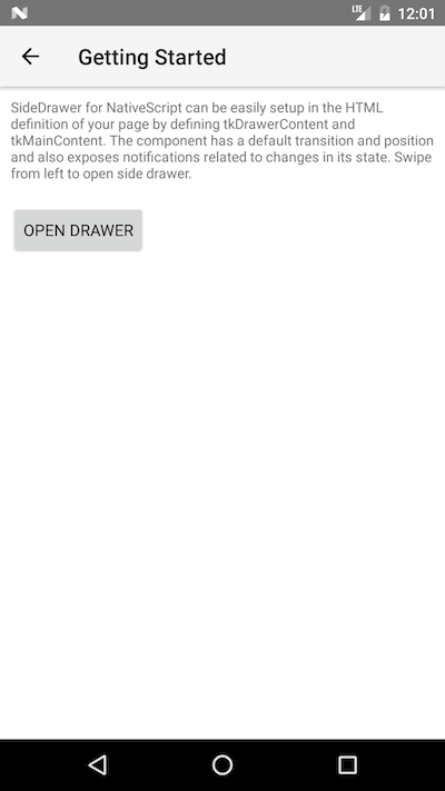
Figure 1. RadSideDrawer's 'tkMainContent'


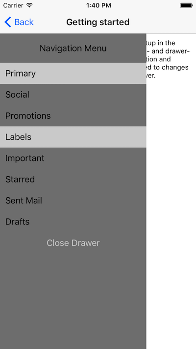
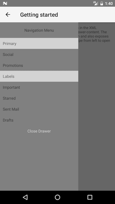
Figure 2. RadSideDrawer's 'tkDrawerContent'


References
Want to see this scenario in action? Check our SDK examples repository on GitHub. You will find this and a lot more practical examples with NativeScript UI.
Related articles you might find useful: