Chart Pie Series
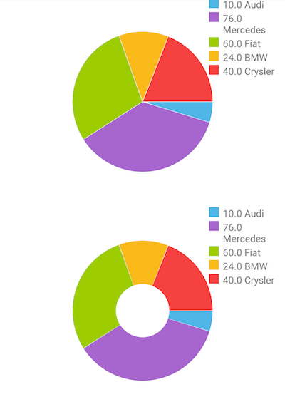
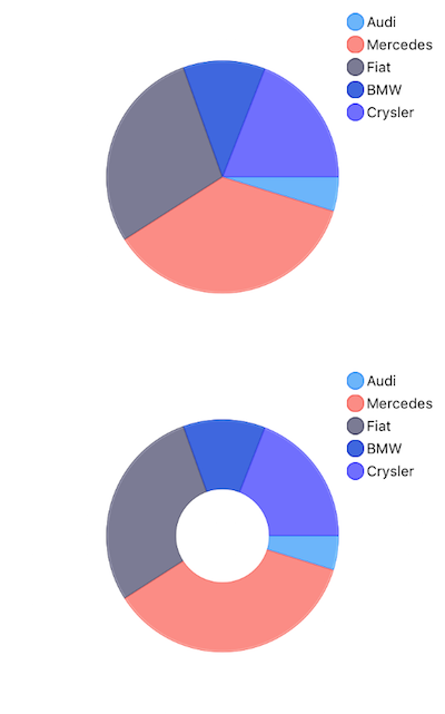
PieSeries are a type of ChartSeries that use a circular statistical graphic, which is divided into slices to illustrate numerical proportion. In a pie chart, the arc length of each slice (and consequently its central angle and area), is proportional to the quantity it represents. The names comes from the chart's resemblance to a pie which has been sliced.
Setup
To display a Pie Chart, you will need to:
- Add RadPieChart to your page.
- Add an instance of PieSeries with the v-tkPieSeries directive and set its items property to a collection of data items and its valueProperty to the name of the property used to determine where to determine the proportion between the splices.
To illustrate this setup, let's create an example. Just like with all vue 'pages' let's start with the Component in which we will place our RadCartesianChart instance. Before that, we would create a basic JS or TS module that contains a collection of objects, which will be used by the chart to provide intuitive data visualization.
#### Example 1: Define a collection of items
export const getPieData = () => {
  return new ObservableArray([
      { Brand: 'Audi', Amount: 10 },
      { Brand: 'Mercedes', Amount: 76 },
      { Brand: 'Fiat', Amount: 60 },
      { Brand: 'BMW', Amount: 24 },
      { Brand: 'Crysler', Amount: 40 }
  ]);
};
#### Example 2: Add chart to component's template
import { getPieData } from '../../data';

const description = 'Pie Series';

export default {
  name: 'PieSeriesExample',
  description: description,
  template: `
  <Page>
    <ActionBar :title="title">
      <NavigationButton text="Back" android.systemIcon="ic_menu_back" @tap="onNavigationButtonTap"></NavigationButton>
    </ActionBar>
    <GridLayout rows="*, *">
      <RadPieChart allowAnimation="true" row="0">
        <PieSeries v-tkPieSeries
          selectionMode="DataPoint"
          expandRadius="0.4"
          outerRadiusFactor="0.7"
          valueProperty="Amount"
          legendLabel="Brand"
          :items="items" />

        <RadLegendView v-tkPieLegend position="Right" title="Brands" offsetOrigin="TopRight" width="110" enableSelection="true"></RadLegendView>
      </RadPieChart>

      <RadPieChart allowAnimation="true" row="1">
        <DonutSeries v-tkPieSeries
          selectionMode="DataPoint"
          expandRadius="0.4"
          outerRadiusFactor="0.7"
          innerRadiusFactor="0.4"
          valueProperty="Amount"
          legendLabel="Brand"
          :items="items" />

        <RadLegendView v-tkPieLegend position="Right" title="Brands" offsetOrigin="TopRight" width="110" enableSelection="true"></RadLegendView>
      </RadPieChart>
    </StackLayout>
  </Page>
  `,
  data () {
    return {
      title: description,
      items: getPieData(),
    };
  },
  methods: {
    onNavigationButtonTap() {
      Frame.topmost().goBack();
    },
  },
};
Figure 1: Chart with PieSeries on Android (left) and iOS (right)


Properties
-
outerRadiusFactor- This property can increase and decrease the diameter of the series. By default, it occupies the whole plot area and is equal to 1. Setting the outerRadius to 0.9 will decrease the radius of the series by 10 percent. Similarly, the value 1.1 will increase it. Leaving the property with value 1 will make the donut fill the available space. -
expandRadius- This property defines the extent to which the selected pie segment is shifted. Again, this property is measured in percents. A value of 1.1 defines that the selected segment will expand by 10% of the pie radius. -
startAngleandendAngle- These properties are used to define the pie range. ThestartAnglesets the angle in degrees from which the drawing of the pie segments will begin. Its default value is 0. TheendAngledetermines whether the chart will appear as a full circle or a partial circle. Its default value is 360 degrees.
References
Want to see this scenario in action? Check our SDK examples repo on GitHub. You will find this and many other practical examples with NativeScript UI.
Examples used in this article:
Related articles you might find useful: