Chart OHLC Series
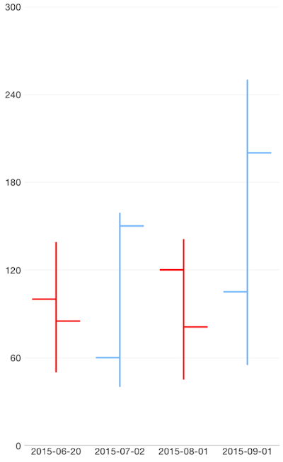
OhlcSeries are a type of CategoricalSeries that are typically used to illustrate movements in the price of a financial instrument over time. That movement is represented by lines visualizing the open, high, low and close price (thus the name Ohlc) for a specific period. Each line on the chart shows the price range (the highest and lowest prices) over one unit of time, e.g., one day or one hour. Tick marks project from each side of the line indicating the opening (starting) price on the left, and the closing (ending) price for that time period on the right. The lines are shown in different colors depending on whether prices rose or fell in that period.
Setup
To display an Ohlc Chart, you will need to:
- Add a RadCartesianChart to your component.
- Add a category axis (CategoricalAxis, DateTimeCategoricalAxis or DateTimeContinuousAxis) with the v-tkCartesianHorizontalAxis directive.
- Add a value axis (LinearAxis or LogarithmicAxis) with the v-tkCartesianVerticalAxis directive.
- Add at least one instance of OhlcSeries with the v-tkCartesianSeries directive and set its items property to a collection of data items, its categoryProperty set to the name of the property of the data items that will be used to determine their category and the openPropertyName, highPropertyName, lowPropertyName and closePropertyName set to the names of the properties used to determine the open, high, low and close values.
To illustrate this setup, let's create an example. Just like with all vue 'pages' let's start with the Component in which we will place our RadCartesianChart instance. Before that, we would create a basic JS or TS module that contains a collection of objects, which will be used by the chart to provide intuitive data visualization.
#### Example 1: Define a collection of items
export const getCandlestickData = () => {
  return new ObservableArray([
    { Date: '01/6/2015', Open: 100, Close: 85, Low: 50, High: 139 },
    { Date: '27/7/2015', Open: 60, Close: 150, Low: 40, High: 159 },
    { Date: '18/8/2015', Open: 120, Close: 81, Low: 45, High: 141 },
    { Date: '19/9/2015', Open: 105, Close: 200, Low: 55, High: 250 }
  ]);
};

export const getOhlcData = () => {
  return new ObservableArray([
    { Date: "20/6/2015", Open: 100, Close: 85, Low: 50, High: 139 },
    { Date: "02/7/2015", Open: 60, Close: 150, Low: 40, High: 159 },
    { Date: "01/8/2015", Open: 120, Close: 81, Low: 45, High: 141 },
    { Date: "01/9/2015", Open: 105, Close: 200, Low: 55, High: 250 }
  ]);
};
#### Example 2: Add chart to component's template
import { getOhlcData } from '../../data';

const description = 'Ohlc Series';

export default {
  name: 'OhlcSeriesExample',
  description: description,
  template: `
  <Page>
    <ActionBar :title="title">
      <NavigationButton text="Back" android.systemIcon="ic_menu_back" @tap="onNavigationButtonTap"></NavigationButton>
    </ActionBar>
    <RadCartesianChart>
      <DateTimeCategoricalAxis v-tkCartesianHorizontalAxis dateFormat="yyyy-MM-dd" verticalLocation="Bottom"></DateTimeCategoricalAxis>
      <LinearAxis v-tkCartesianVerticalAxis></LinearAxis>
      <OhlcSeries v-tkCartesianSeries
        categoryProperty="Date"
        openPropertyName="Open"
        highPropertyName="High"
        lowPropertyName="Low"
        closePropertyName="Close"
        :items="items" />
    </RadCartesianChart>
  </Page>
  `,
  data () {
    return {
      title: description,
      items: getOhlcData(),
    };
  },
  methods: {
    onNavigationButtonTap() {
      Frame.topmost().goBack();
    },
  },
};
Figure 1: Chart with OhlcSeries on Android (left) and iOS (right)


References
Want to see this scenario in action? Check our SDK examples repo on GitHub. You will find this and many other practical examples with NativeScript UI.
Examples used in this article:
Related articles you might find useful: