Chart Range Bar Series
RangeBarSeries are a type of CategoricalSeries that present categorical data with rectangular bars with heights or lengths proportional to the values that they represent. They differ from BarSeries by the fact that they represent two values - low and high and each bar represent the difference between a point's low and high value. The range bar chart usually shows comparisons among discrete categories but can also be used to visualize a trend in data over intervals of time.
Setup
To display a Range Bar Chart, you will need to:
- Add a RadCartesianChart to your component.
- Add a category axis (CategoricalAxis, DateTimeCategoricalAxis or DateTimeContinuousAxis) with the v-tkCartesianHorizontalAxis directive.
- Add a value axis (LinearAxis or LogarithmicAxis) with the v-tkCartesianVerticalAxis directive.
-
Add at least one instance of RangeBarSeries with the v-tkCartesianSeries directive and set its items property to a collection of data items, its categoryProperty set to the name of the property of the data items that will be used to determine their category and the lowPropertyName and highPropertyName to the names of the properties used to determine their low and high values.
The above setup will create a chart with vertical bars. If you need horizontal bars, you can swap the axes' position and add the v-tkCartesianVerticalAxis to the category axis and the v-tkCartesianHorizontalAxis to the value axis.
To illustrate this setup, let's create an example. Just like with all vue 'pages' let's start with the Component in which we will place our RadCartesianChart instance. Before that, we would create a basic JS or TS module that contains a collection of objects, which will be used by the chart to provide intuitive data visualization.
#### Example 1: Define a collection of items
export const getRangeBarData = () => {
  return new ObservableArray([
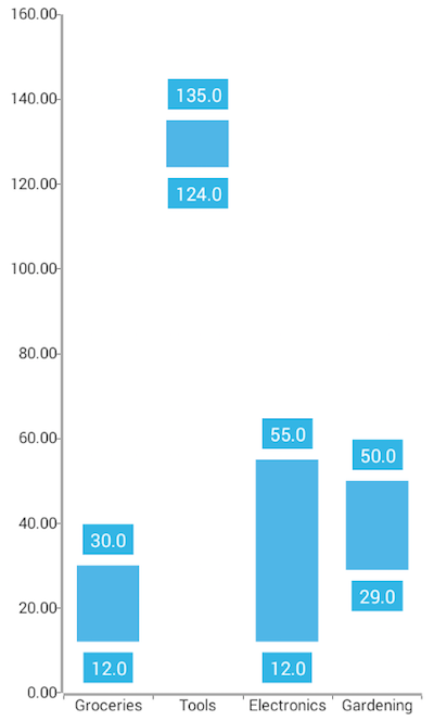
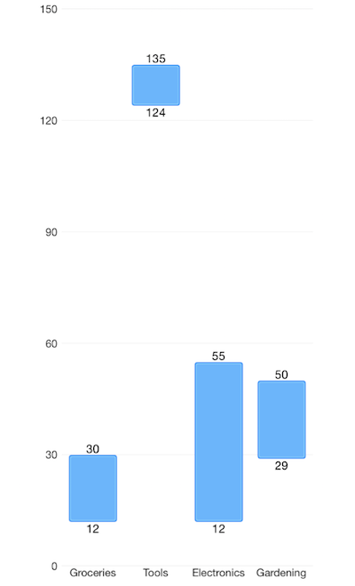
    { Name: 'Groceries', High: 30, Low: 12, Sales: 0, Margin: 0 },
    { Name: 'Tools', High: 135, Low: 124, Sales: 0, Margin: 0 },
    { Name: 'Electronics', High: 55, Low: 12, Sales: 0, Margin: 0 },
    { Name: 'Gardening', High: 50, Low: 29, Sales: 0, Margin: 0 }
  ]);
};
#### Example 2: Add chart to component's template
import { getRangeBarData } from '../../data';

const description = 'Range Bar Series';

export default {
  name: 'RangeBarSeriesExample',
  description: description,
  template: `
  <Page>
    <ActionBar :title="title">
      <NavigationButton text="Back" android.systemIcon="ic_menu_back" @tap="onNavigationButtonTap"></NavigationButton>
    </ActionBar>
    <RadCartesianChart>
      <LinearAxis v-tkCartesianVerticalAxis horizontalLocation="Left" labelSize="11"/>
      <CategoricalAxis v-tkCartesianHorizontalAxis verticalLocation="Bottom" labelSize="11"/>
      <RangeBarSeries v-tkCartesianSeries
        showLabels="true"
        categoryProperty="Name"
        lowPropertyName="Low"
        highPropertyName="High"
        :items="items"/>
    </RadCartesianChart>
  </Page>
  `,
  data () {
    return {
      title: description,
      items: getRangeBarData(),
    };
  },
  methods: {
    onNavigationButtonTap() {
      Frame.topmost().goBack();
    },
  },
};
Figure 1: Chart with RangeBarSeries on Android (left) and iOS (right)


References
Want to see this scenario in action? Check our SDK examples repo on GitHub. You will find this and many other practical examples with NativeScript UI.
Examples used in this article:
Related articles you might find useful: