Chart Bubble Series
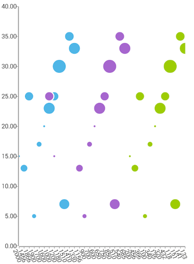
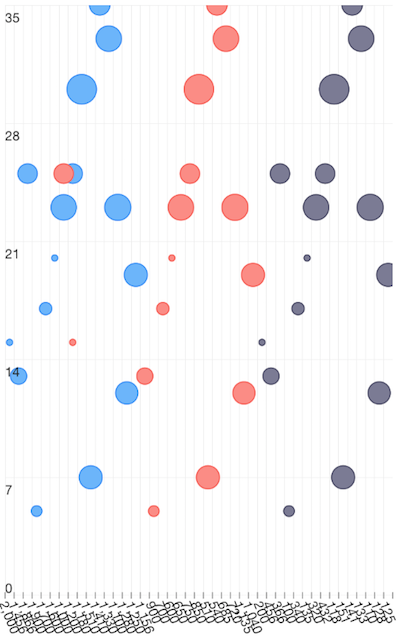
BubbleSeries are a type of CategoricalSeries that present categorical data with bubble shapes plot on cartesian coordinates based on the values that they represent. The bubble chart usually shows comparisons among discrete categories but can also be used to visualize a trend in data over intervals of time. They differ from BarSeries not only by the shape used, but also that they can visualize a third value (on top of category and value) through the size of the bubbles. If you want to show bubbles for data which is not categorical, you can use ScatterBubbleSeries.
Setup
To display a Bubble Chart, you will need to:
- Add a RadCartesianChart to your component.
- Add a category axis (CategoricalAxis, DateTimeCategoricalAxis or DateTimeContinuousAxis) with the v-tkCartesianHorizontalAxis directive.
- Add a value axis (BubbleSeries or LogarithmicAxis) with the v-tkCartesianVerticalAxis directive.
- Add at least one instance of BubbleSeries with the v-tkCartesianSeries directive and set its items property to a collection of data items, its categoryProperty to the name of the property of the data items that will be used to determine their category, its valueProperty to the name of the property used to determine their value and its bubbleSizeProperty to the name of the property used to determine the size of the bubble.
To illustrate this setup, let's create an example. Just like with all vue 'pages' let's start with the Component in which we will place our RadCartesianChart instance. Before that, we would create a basic JS or TS module that contains a collection of objects, which will be used by the chart to provide intuitive data visualization.
#### Example 1: Define a collection of items
export const getHighDataModel = () => {
  return new ObservableArray([
    { Year: 2000, Amount: 15, Impact: 1, Country: '', SecondVal: 0, ThirdVal: 0 },
    { Year: 1456, Amount: 13, Impact: 7, Country: '', SecondVal: 0, ThirdVal: 0 },
    { Year: 1866, Amount: 25, Impact: 10, Country: '', SecondVal: 0, ThirdVal: 0 },
    { Year: 1900, Amount: 5, Impact: 3, Country: '', SecondVal: 0, ThirdVal: 0 },
    { Year: 1700, Amount: 17, Impact: 4, Country: '', SecondVal: 0, ThirdVal: 0 },
    { Year: 1600, Amount: 20, Impact: 1, Country: '', SecondVal: 0, ThirdVal: 0 },
  ]);
};

export const getMiddleDataModel = () => {
  return new ObservableArray([
    { Year: 1200, Amount: 15, Impact: 1, Country: '', SecondVal: 0, ThirdVal: 0 },
    { Year: 1156, Amount: 13, Impact: 7, Country: '', SecondVal: 0, ThirdVal: 0 },
    { Year: 1000, Amount: 25, Impact: 10, Country: '', SecondVal: 0, ThirdVal: 0 },
    { Year: 900, Amount: 5, Impact: 3, Country: '', SecondVal: 0, ThirdVal: 0 },
    { Year: 700, Amount: 17, Impact: 4, Country: '', SecondVal: 0, ThirdVal: 0 },
    { Year: 600, Amount: 20, Impact: 1, Country: '', SecondVal: 0, ThirdVal: 0 },
  ]);
};

export const getLowDataModel = () => {
  return new ObservableArray([
    { Year: 200, Amount: 15, Impact: 1, Country: '', SecondVal: 0, ThirdVal: 0 },
    { Year: 456, Amount: 13, Impact: 7, Country: '', SecondVal: 0, ThirdVal: 0 },
    { Year: 366, Amount: 25, Impact: 10, Country: '', SecondVal: 0, ThirdVal: 0 },
    { Year: 100, Amount: 5, Impact: 3, Country: '', SecondVal: 0, ThirdVal: 0 },
    { Year: 340, Amount: 17, Impact: 4, Country: '', SecondVal: 0, ThirdVal: 0 },
    { Year: 135, Amount: 20, Impact: 1, Country: '', SecondVal: 0, ThirdVal: 0 },
  ]);
};
Example 2: Add chart to component's template
import { getLowDataModel, getMiddleDataModel, getHighDataModel } from '../../data';

const description = 'Bubble Series';

export default {
  name: 'BubbleSeriesExample',
  description: description,
  template: `
  <Page>
    <ActionBar :title="title">
      <NavigationButton text="Back" android.systemIcon="ic_menu_back" @tap="onNavigationButtonTap"></NavigationButton>
    </ActionBar>
    <RadCartesianChart>
      <LinearAxis v-tkCartesianVerticalAxis />
      <CategoricalAxis v-tkCartesianHorizontalAxis verticalLocation="Bottom" labelFitMode="Rotate" labelRotationAngle="1.2"></CategoricalAxis>

      <BubbleSeries v-tkCartesianSeries
                    :items="highDataModel"
                    bubbleScale="5"
                    categoryProperty="Year"
                    valueProperty="Amount"
                    bubbleSizeProperty="Impact"></BubbleSeries>

      <BubbleSeries v-tkCartesianSeries
                    :items="middleDataModel"
                    bubbleScale="5"
                    categoryProperty="Year"
                    valueProperty="Amount"
                    bubbleSizeProperty="Impact"></BubbleSeries>

      <BubbleSeries v-tkCartesianSeries
                    :items="lowDataModel"
                    bubbleScale="5"
                    categoryProperty="Year"
                    valueProperty="Amount"
                    bubbleSizeProperty="Impact"></BubbleSeries>

    </RadCartesianChart>
  </Page>
  `,
  data () {
    return {
      title: description,
      highDataModel: getHighDataModel(),
      middleDataModel: getMiddleDataModel(),
      lowDataModel: getLowDataModel(),
    };
  },
  methods: {
    onNavigationButtonTap() {
      Frame.topmost().goBack();
    },
  },
};
Figure 1: Chart with BubbleSeries on Android (left) and iOS (right)


Bubble Scale
Additionally, BubbleSeries expose a bubbleScale property which can be used to fine-tune the size of the bubbles according to specific application requirements. The way the bubbleScale property works is by multiplying its value to the radius calculated for each data-point's bubble to determine the bubble's final size.
References
Want to see this scenario in action? Check our SDK examples repo on GitHub. You will find this and many other practical examples with NativeScript UI.
Examples used in this article:
Related articles you might find useful: