RadSideDrawer Getting Started
This article explains how to create a simple RadSideDrawer with Vue.
By design the
RadSideDraweris designed to be placed as a single child in your component's HTML, this excludes the use of a<ActionBar><ActionBar>which is not treated as a simple element by NativeScript and can be used withRadSideDrawerby placing it in the beginning of the HTML.
Installation
Run the following command to add the plugin to your application:
tns plugin add nativescript-ui-sidedrawer
Initialization
Before proceeding, make sure that the nativescript-ui-sidedrawer/vue module is required inside your application. This module handles the registration of the custom directives and elements required by nativescript-vue.
The RadSideDrawer consists of two visual parts:
-
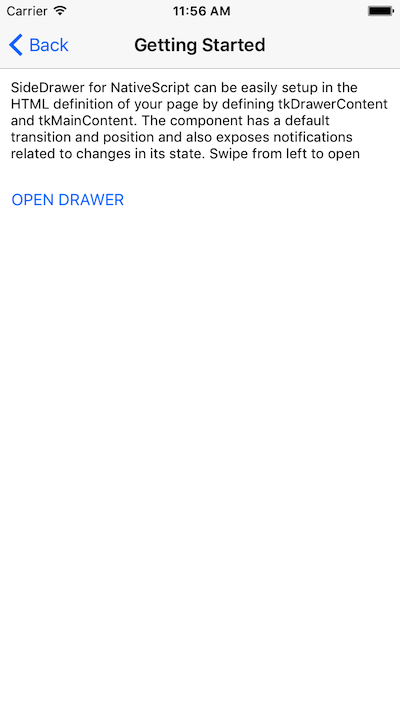
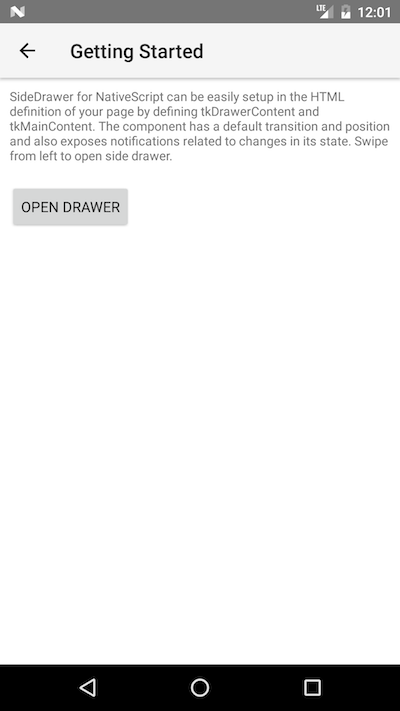
mainContent- the visual elements displayed in the host view where the drawer is shown. -
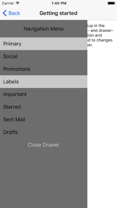
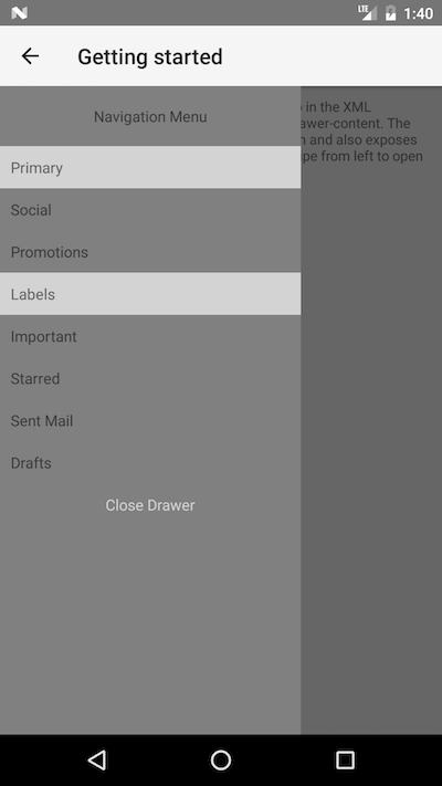
drawerContent- the visual elements displayed in the side drawer.
Defining mainContent and drawerContent with Vue is done using the ~ syntax:
~drawerContent~mainContent
The following code snippet is a simple template with a basic setup for RadSideDrawer.
export default {
  name: 'GettingStarted',
  description: description,
  template: `
  <Page>
    <ActionBar :title="title">
      <NavigationButton text="Back" android.systemIcon="ic_menu_back" @tap="onNavigationButtonTap"></NavigationButton>
    </ActionBar>
    <RadSideDrawer ref="drawer">
      <StackLayout ~drawerContent class="sideStackLayout">
          <StackLayout class="sideTitleStackLayout">
              <Label text="Navigation Menu"></Label>
          </StackLayout>
          <StackLayout class="sideStackLayout">
              <Label text="Primary" class="sideLabel sideLightGrayLabel"></Label>
              <Label text="Social" class="sideLabel"></Label>
              <Label text="Promotions" class="sideLabel"></Label>
              <Label text="Labels" class="sideLabel sideLightGrayLabel"></Label>
              <Label text="Important" class="sideLabel"></Label>
              <Label text="Starred" class="sideLabel"></Label>
              <Label text="Sent Mail" class="sideLabel"></Label>
              <Label text="Drafts" class="sideLabel"></Label>
          </StackLayout>
          <Label text="Close Drawer" color="lightgray" padding="10" style="horizontal-align: center" @tap="onCloseDrawerTap"></Label>
      </StackLayout>
      <StackLayout ~mainContent>
          <Label textWrap="true" class="drawerContentText"></Label>
          <StackLayout orientation="Horizontal">
            <Button text="OPEN DRAWER" @tap="onOpenDrawerTap()" class="drawerContentButton"></Button>
            <Button text="TOGGLE DRAWER" @tap="onToggleDrawerTap()" class="drawerContentButton"></Button>
          </StackLayout>
      </StackLayout>
    </RadSideDrawer>
  </Page>
  `,
  data () {
    return {
      title: description,
      mainContentText: 'SideDrawer for NativeScript can be easily setup in the HTML\
definition of your page by defining tkDrawerContent and tkMainContent. \
The component has a default transition and position and also exposes notifications\
related to changes in its state. Swipe from left to open side drawer.',
    };
  },
  methods: {
    onNavigationButtonTap() {
      Frame.topmost().goBack();
    },
    onOpenDrawerTap() {
      this.$refs.drawer.showDrawer();
    },
    onCloseDrawerTap() {
      this.$refs.drawer.closeDrawer();
    },
    onToggleDrawerTap() {
      this.$refs.drawer.toggleDrawerState();
    },
  },
};
Figure 1. RadSideDrawer's '~mainContent'


Figure 2. RadSideDrawer's '~drawerContent'

