Chart Series Labels
If you followed the getting started article, you now know how to create a chart and add it to a NativeScript page. In this article, you will learn how to control the series labels and customize their appearance. All series have their default labels. In order to display them, you simply need to set the showLabels property of the series to true.
Styling with Label Style
One option to style the labels that are shown for series values is to initialize the labelStyle property of the series with instance of PointLabelStyle. The supported properties are:
-
fillColor: Used to specify the label background color. -
strokeColor: Used to specify the color of the label stroke. -
strokeWidth: Used to specify the width of the label stroke. -
margin: Used to specify the device independent pixels between the label and the related data point. -
textFormat: Used to specify the string used as a formating string for label value. For example to format values to one symbol after decimal point and append the textseconds, you can use the following format:%.1f seconds. -
textColor: Used to specify the color for the text of the labels. -
textSize: Used to specify the size of the text of the labels. -
fontName: Used to specify the font name. If it is missing from the OS the default font is used instead. -
fontStyle: Used to specify the style of font.Bold,Italic,BoldItalicandNormalvalues can be used. Defaults toNormal.
To better illustrate styling of point label let's look at the following example:
Example 1: Apply series label styles through component template
<PointLabelStyle v-tkLineLabelStyle margin="10" fontStyle="Bold" fillColor="#60B3FC" textSize="10" textColor="White"></PointLabelStyle>
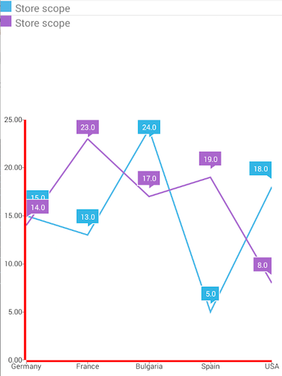
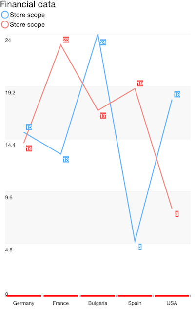
This is how the chart looks like now:
Figure 1: Axis styles on Android (left) and iOS (right)


Styling with CSS
Another option to style all of the labels for the series of a chart is to use the label's CSS type selector - ChartSeriesLabel. Here's the list of values that are supported:
- color - The color used for the text of the labels.
- background-color - The color used for the background of the label.
- border-color - The color used for the background of the label. Note that the labels only support a single value that is applied for the border of its four sides.
- border-width - The width used for the background of the label. Note that the labels only support a single value that is applied for the border of its four sides.
- margin - A single numeric value representing the device independent pixels between the label and the related data point.
- padding - The space between the label's text and its border.
- font-related properties (font-size, font-family, etc.)
-
format - The format used to display the series' labels. For example to format values to one symbol after decimal point and append the text
seconds, you can use the following format:%.1f seconds.
Here's how to apply the styles from the previous example through CSS:
Example 2: Apply series label styles through css
ChartSeriesLabel {
    margin: 10;
    font-weight: bold;
    background-color: #60B3FC;
    font-size: 10;
    color: white;
}
References
Want to see this scenario in action? Check our SDK Examples repository on GitHub. You will find this and many other practical examples with NativeScript UI.
Examples used in this article:
Related articles you might find useful: