Chart Trackball
If you followed the getting started article, you now know how to create a chart and add it to a NativeScript page. In this article, you will learn how to add a trackball that can be used to display additional information about a highlighted point. For example, in a Financial chart the Trackball can display the Open, High, Low and Close value of a stock for a single day. The Trackball is displayed when the user holds a finger on the plot area of the chart and drags it through the set of data points a given series represents. RadCartesianChart supports displaying a trackball via its trackball property.
Getting Started
To define a trackball on your RadCartesianChart you need to use the TKCartesianTrackballDirective directive in your chart as shown below:
Example 1: A Cartesian Chart with a Trackball
import { getCandleStickData } from '../../data';

const description = 'Trackball';

export default {
  name: 'TrackballExample',
  description: description,
  template: `
  <Page>
    <ActionBar :title="title">
      <NavigationButton text="Back" android.systemIcon="ic_menu_back" @tap="onNavigationButtonTap"></NavigationButton>
    </ActionBar>
    <GridLayout rows="auto, *">
      <Label text="Tap and hold on a given datapoint to display the Trackball. Drag across datapoints to update the Trackball position." textWrap="true"></Label>
      <RadCartesianChart row="1">
        <DateTimeCategoricalAxis v-tkCartesianHorizontalAxis dateFormat="yyyy-MM-dd" verticalLocation="Bottom"></DateTimeCategoricalAxis>
        <LinearAxis v-tkCartesianVerticalAxis></LinearAxis>
        <Trackball v-tkCartesianTrackball></Trackball>
        <CandlestickSeries v-tkCartesianSeries
          categoryProperty="Date" :items="items"
          openPropertyName="Open" highPropertyName="High" lowPropertyName="Low" closePropertyName="Close">
        </CandlestickSeries>
      </RadCartesianChart>
    </GridLayout>
  </Page>
  `,
  data () {
    return {
      title: description,
      items: getCandleStickData(),
    };
  },
  methods: {
    onNavigationButtonTap() {
      Frame.topmost().goBack();
    },
  },
};
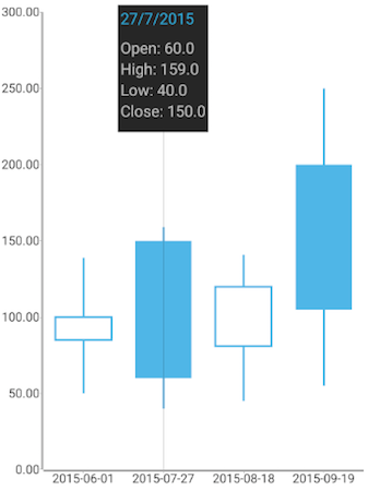
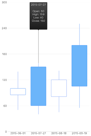
Depending on your current setup, the trackball will display information about the data points within the chart in a different manner. For example, in a RangeBarSeries the trackball will display the range values alongside with the current category value. In a OhlcSeries or CandlestickSeries the trackball will display the Open, High, Low and Close values alongside with the current category value. Here's an example:
Figure 1: Trackball shown in action on Android (left) and iOS (right)


Features
SnapMode
By using the snapMode property you can control how the trackball is positioned relative to the series and the data points within. Possible values are defined by the ChartTrackballSnapMode enum.
Intersection Points
By using the showIntersectionPoints property you can determine whether information about all of the relevant data points will be shown in the trackball. This behavior is dependent on the snapMode property setting.
Custom Content
You can customize the content within the trackball by using the trackBallContentRequestedEvent event. This event is fired each time information about a given data point is needed for the trackball. The event exposes an instance of the TrackballCustomContentData. This class extends the ChartEventData class and adds two new properties:
-
seriesIndex- the index of the active series with which the user has started interacting -
content- used to override the default data point content. By setting this property you can customize the content within the trackball for the provided data point. You can use the base event data properties to obtain the data point index and the business object for which the data point has been generated for
References
Want to see this scenario in action? Check our SDK Examples repository on GitHub. You will find this and many other practical examples with NativeScript UI.
Examples used in this article:
Related articles you might find useful: