Chart Line Series
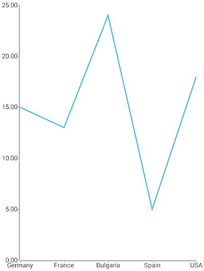
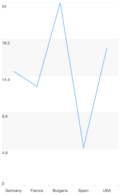
LineSeries are a type of CategoricalSeries that present categorical data as points connected with a line. The line chart usually visualizes a trend in data over intervals of time, but can also be used to show comparisons among discrete categories.
Setup
To display a Line Chart, you will need to:
- Add a RadCartesianChart to your component.
- Add a category axis (CategoricalAxis, DateTimeCategoricalAxis or DateTimeContinuousAxis) with the v-tkCartesianHorizontalAxis directive.
- Add a value axis (LinearAxis or LogarithmicAxis) with the v-tkCartesianVerticalAxis directive.
- Add at least one instance of LineSeries with the v-tkCartesianSeries directive and set its items property to a collection of data items, its categoryProperty to the name of the property of the data items that will be used to determine their category and its valueProperty to the name of the property used to determine their value.
To illustrate this setup, let's create an example. Just like with all vue 'pages' let's start with the Component in which we will place our RadCartesianChart instance. Before that, we would create a basic JS or TS module that contains a collection of objects, which will be used by the chart to provide intuitive data visualization.
#### Example 1: Define a collection of items
import { ObservableArray } from 'tns-core-modules/data/observable-array';

export const getCountriesData = () => {
  return new ObservableArray([
    { Country: 'Germany', Amount: 15, SecondVal: 14, ThirdVal: 24, Impact: 0, Year: 0 },
    { Country: 'France', Amount: 13, SecondVal: 23, ThirdVal: 25, Impact: 0, Year: 0 },
    { Country: 'Bulgaria', Amount: 24, SecondVal: 17, ThirdVal: 23, Impact: 0, Year: 0 },
    { Country: 'Spain', Amount: 11, SecondVal: 19, ThirdVal: 24, Impact: 0, Year: 0 },
    { Country: 'USA', Amount: 18, SecondVal: 8, ThirdVal: 21, Impact: 0, Year: 0 }
  ]);
};
#### Example 2: Add chart to component's template
import { getCountriesData } from '../../data';

const description = 'Line Series';

export default {
  name: 'LineSeriesExample',
  description: description,
  template: `
  <Page>
    <ActionBar :title="title">
      <NavigationButton text="Back" android.systemIcon="ic_menu_back" @tap="onNavigationButtonTap"></NavigationButton>
    </ActionBar>
    <RadCartesianChart>
      <CategoricalAxis v-tkCartesianHorizontalAxis />
      <LinearAxis v-tkCartesianVerticalAxis />
      <LineSeries v-tkCartesianSeries
                  :items="items"
                  categoryProperty="Country"
                  valueProperty="Amount" />
    </RadCartesianChart>
  </Page>
  `,
  data () {
    return {
      title: description,
      items: getCountriesData(),
    };
  },
  methods: {
    onNavigationButtonTap() {
      Frame.topmost().goBack();
    },
  },
};
Figure 1: Chart with LineSeries on Android (left) and iOS (right)


References
Want to see this scenario in action? Check our SDK examples repo on GitHub. You will find this and many other practical examples with NativeScript UI.
Examples used in this article:
Related articles you might find useful: