Chart Annotations
If you followed the getting started article, you now know how to create a chart and add it to a NativeScript page. In this article, you will learn how to add and customize annotations.
Overview
Annotations are visual elements used to highlight certain areas on the plot. They can be used as markers for specific values on the plot.
RadCartesianChart provides support for the following types of annotations:
-
ChartGridLineAnnotation: This annotation is visually represented by straight lines across the chart that marks a specific value on the associatedCartesianAxis. -
ChartPlotBandAnnotation: This annotation is visually represented by a band across the chart that marks a specific range on the associatedCartesianAxis.
Common Features
Adding annotations to chart can be done through the annotations property of the chart. Every chart can have any number of annotations.
ChartGridLineAnnotation and ChartPlotBandAnnotation have common properties that allows customization of their look.
-
axisID- This is the id of the axis that this annotation is bound to. This is mandatory property. -
hidden- Determines if the annotation will be shown or not. Accepts valuestrueorfalse. -
zPosition- Determines if the annotation should be rendered above or bellow the series. -
strokeWidth- Determines the width of the stroked line. -
strokeColor- Determines the color of the annotation. -
strokeDashPattern- Defines the dash pattern of annotation line.
Grid Line Annotations
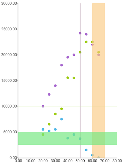
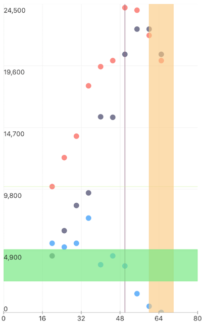
The ChartGridLineAnnotation represents a vertical or horizontal line that crosses the entire plot area at specific value of the assigned axis. There is a mandatory property value that have to be initialized with an appropriate axis value. Here is an example that demonstrates how to define three horizontal one vertical grid line annotations assigned to bar series of the chart. Different set of options determines the visual state and position of annotations and one of the annotations is hidden.
Example 1: A Cartesian Chart with a Grid Line Annotations
import { getScatterData } from '../../data';

const description = 'Grid Line';

export default {
  name: 'GridLine',
  description: description,
  template: `
  <Page>
    <ActionBar :title="title">
      <NavigationButton text="Back" android.systemIcon="ic_menu_back" @tap="onNavigationButtonTap"></NavigationButton>
    </ActionBar>
    <RadCartesianChart>
      <LinearAxis v-tkCartesianHorizontalAxis minimum="0" maximum="80" id="hAxis"></LinearAxis>
      <LinearAxis v-tkCartesianVerticalAxis id="vAxis"></LinearAxis>

      <ScatterSeries v-tkCartesianSeries :items="items" xProperty="Age" yProperty="Savings"></ScatterSeries>
      <ScatterSeries v-tkCartesianSeries :items="items" xProperty="Age" yProperty="Salary"></ScatterSeries>
      <ScatterSeries v-tkCartesianSeries :items="items" xProperty="Age" yProperty="Spendings"></ScatterSeries>

      <ChartGridLineAnnotation v-tkCartesianAnnotations axisId="hAxis" hidden="false" value="50" zPosition="AboveSeries"
        android:strokeWidth="4" ios:strokeWidth="10" strokeColor="#EB916580">
      </ChartGridLineAnnotation>
      <ChartGridLineAnnotation v-tkCartesianAnnotations axisId="vAxis" hidden="false" value="10000" zPosition="AboveSeries"
        android:strokeWidth="4" ios:strokeWidth="10" strokeColor="#DEBFEB80">
      </ChartGridLineAnnotation>
      <ChartPlotBandAnnotation v-tkCartesianAnnotations axisId="hAxis" hidden="false" value="20" zPosition="AboveSeries"
        minValue="60" maxValue="70" fillColor="#A1FAC980" strokeColor="#A1FAC980">
      </ChartPlotBandAnnotation>
      <ChartPlotBandAnnotation v-tkCartesianAnnotations axisId="vAxis" hidden="false" value="20000" zPosition="AboveSeries"
        minValue="2500" maxValue="5000" fillColor="#AC74E880" strokeColor="#AC74E880">
      </ChartPlotBandAnnotation>
    </RadCartesianChart>
  </Page>
  `,
  data () {
    return {
      title: description,
      items: getScatterData(),
    };
  },
  methods: {
    onNavigationButtonTap() {
      Frame.topmost().goBack();
    },
  },
};
This will produce a page showing a Chart with annotations that will look like:
Figure 1: Grid Line Annotations on Android (left) and iOS (right)


Plot Band Annotations
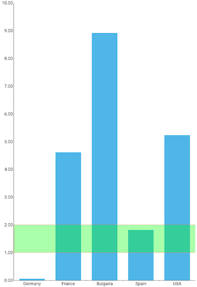
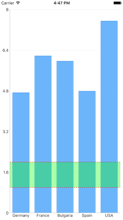
The ChartPlotBandAnnotation represents a vertical or horizontal area that crosses the entire plot area. Here is an example that demonstrates how to define a horizontal ChartPlotBandAnnotation in the chart that we have created above.
There are two additional values that need to be provided along with axisID, minValue and maxValue that will determine the range for the annotation. There is one additional property fillColor that determines the fill color of the band. Here is an example that demonstrates how to define three horizontal one vertical grid line annotations assigned to bar series of the chart:
Example 2: A Cartesian Chart with a Plot Band Annotations:
export default {
  name: 'PlotBand',
  description: description,
  template: `
  <Page>
    <ActionBar :title="title">
      <NavigationButton text="Back" android.systemIcon="ic_menu_back" @tap="onNavigationButtonTap"></NavigationButton>
    </ActionBar>
    <RadCartesianChart>
      <CategoricalAxis v-tkCartesianHorizontalAxis></CategoricalAxis>
      <LinearAxis v-tkCartesianVerticalAxis id="verBarAxis"></LinearAxis>

      <BarSeries v-tkCartesianSeries :items="items" categoryProperty="Country" valueProperty="Amount"></BarSeries>

      <ChartPlotBandAnnotation v-tkCartesianAnnotations axisId="verBarAxis" minValue="2" maxValue="4" zPosition="AboveSeries"
        strokeWidth="2" fillColor="#DDFFFF00" strokeColor="Red" strokeDashPattern="3,3,5,5">
      </ChartPlotBandAnnotation>
    </RadCartesianChart>
  </Page>
  `,
  data () {
    return {
      title: description,
      items: getCountriesData(),
    };
  },
  methods: {
    onNavigationButtonTap() {
      Frame.topmost().goBack();
    },
  },
};
This will produce a page showing a Chart with annotations that will look like:
Figure 2: Plot Band Annotations on Android (left) and iOS (right)


References
Want to see this scenario in action? Check our SDK Examples repository on GitHub. You will find this and many other practical examples with NativeScript UI.
Examples used in this article:
Related articles you might find useful: